In this post, I comment on the final major two libraries I visited during my trip, both in Sweden.
This post follows the first post and second post that covers visiting libraries in Iceland and Finland.
Nestled away in the northern side of town, Stockholm University was the second of two libraries I had arranged a visit with in advance of my trip. While (as far as I’d encountered thus far) not as hyperbolized or idolized for its education as Finland, Sweden certainly has its stereotypes of idealism and a more utopian quality to its society in general. And as such, I was incredibly excited to visit the university and its library, and to meet its director, Wilhelm Widmark.
First, though, I had to get to the library from Stockholm. Stockholm as a city deserves a post all of its own–a marvelous blend of new and old, I was reminded of New York City, minus the skyscrapers. The old town had a vibe comparable to other European cities, most notably (for me) Prague and, of course, nearby Helsinki. But larger, more bustling, and far more diverse. International coverage of Sweden’s issues with accepting refugees and other immigrant populations was aroused in my mind as I explored various neighborhoods and saw a racial diversity far larger than I could imagine. But again, that’s a post for another time.
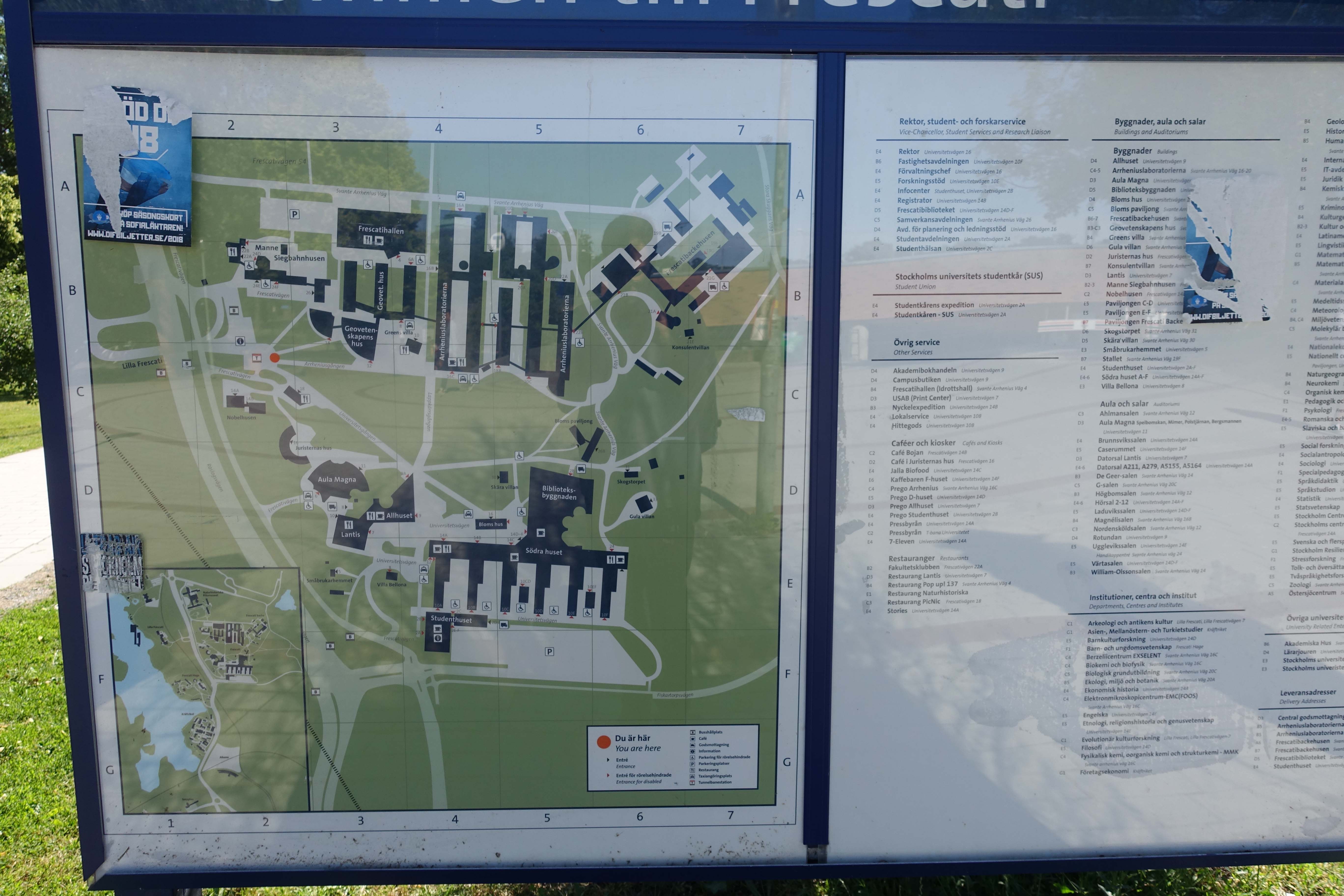
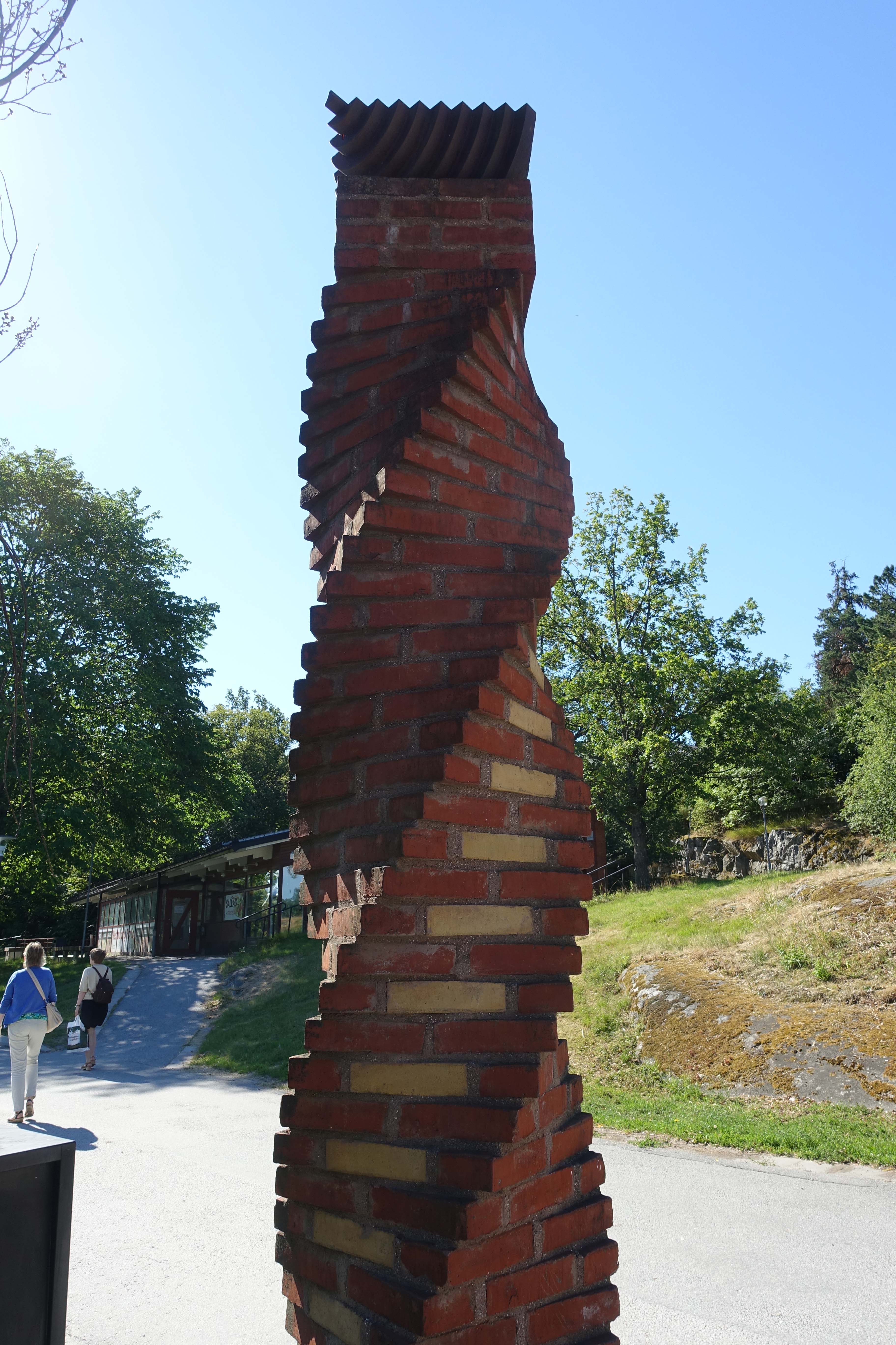
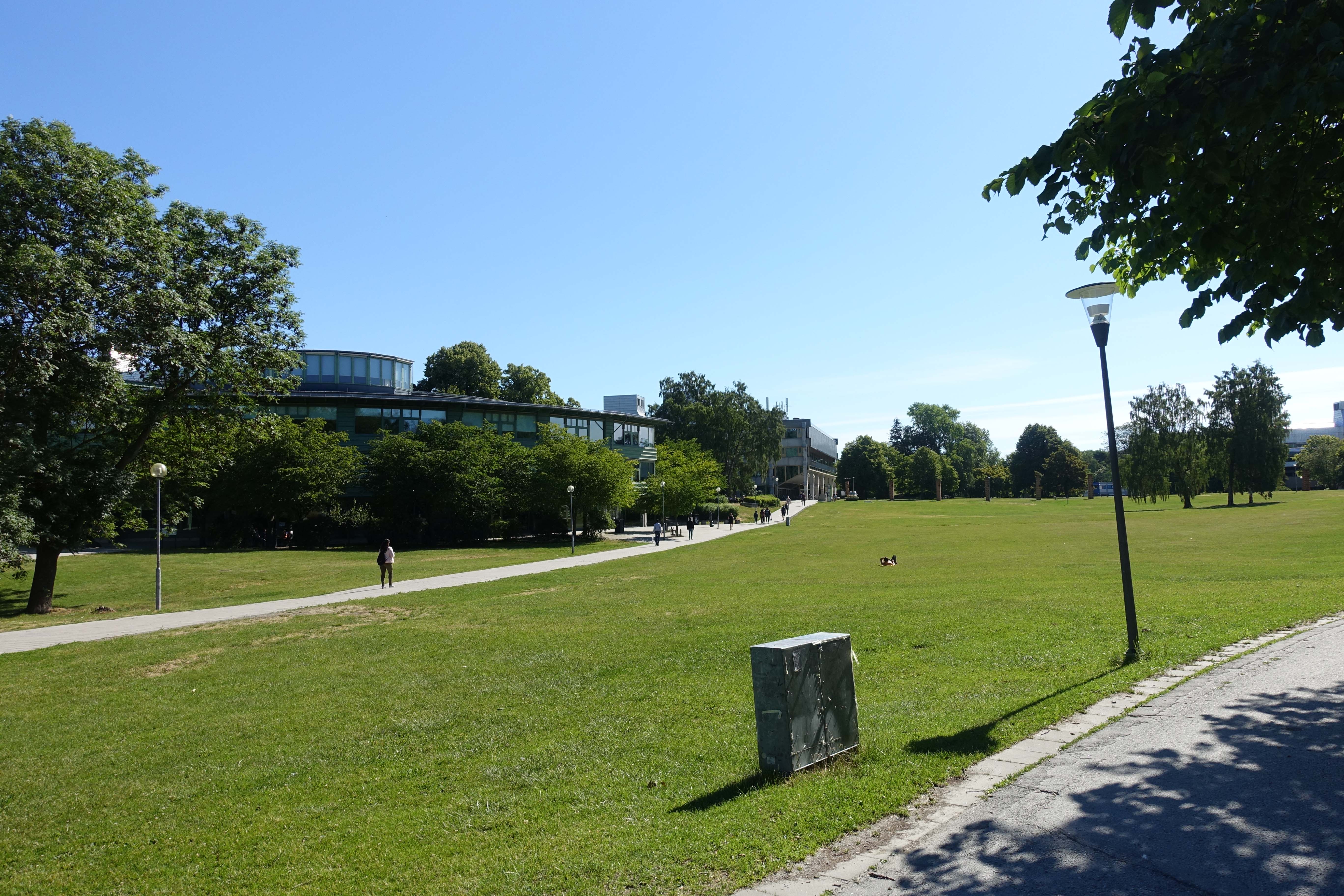
Another feature of Stockholm is its robust and iconic metro system. Each stop has its own aesthetic, complete with installations by different artists (well, for most of the stops anyway). The stop at the University was academic in nature, and, more surprising, the area just outside of the station was pastoral. The charm of the natural environment of the college campus had a compelling effect on me. I also appreciated the design of the campus, which did was relatively straightforward but also a bit sprawling and exploratory.

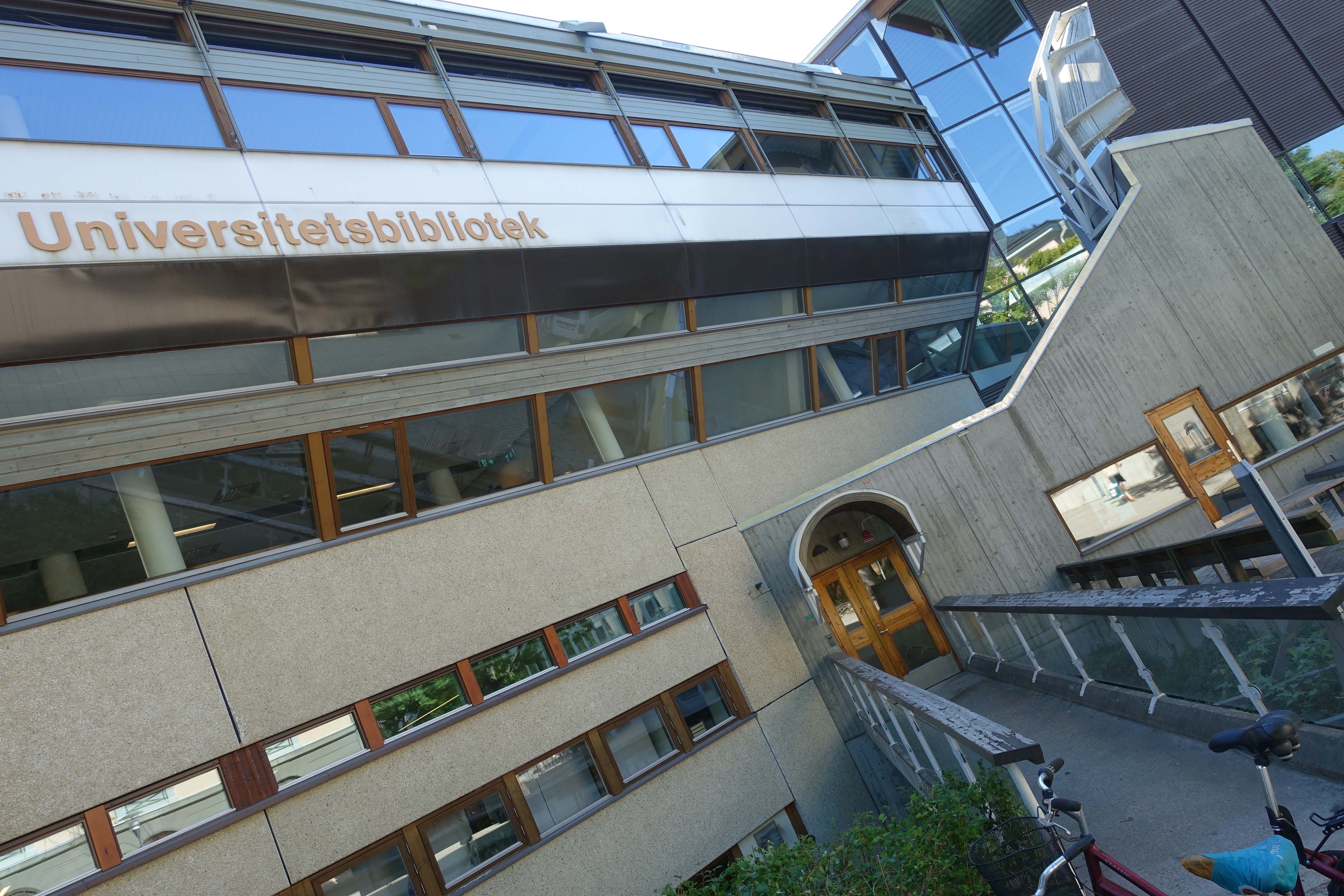
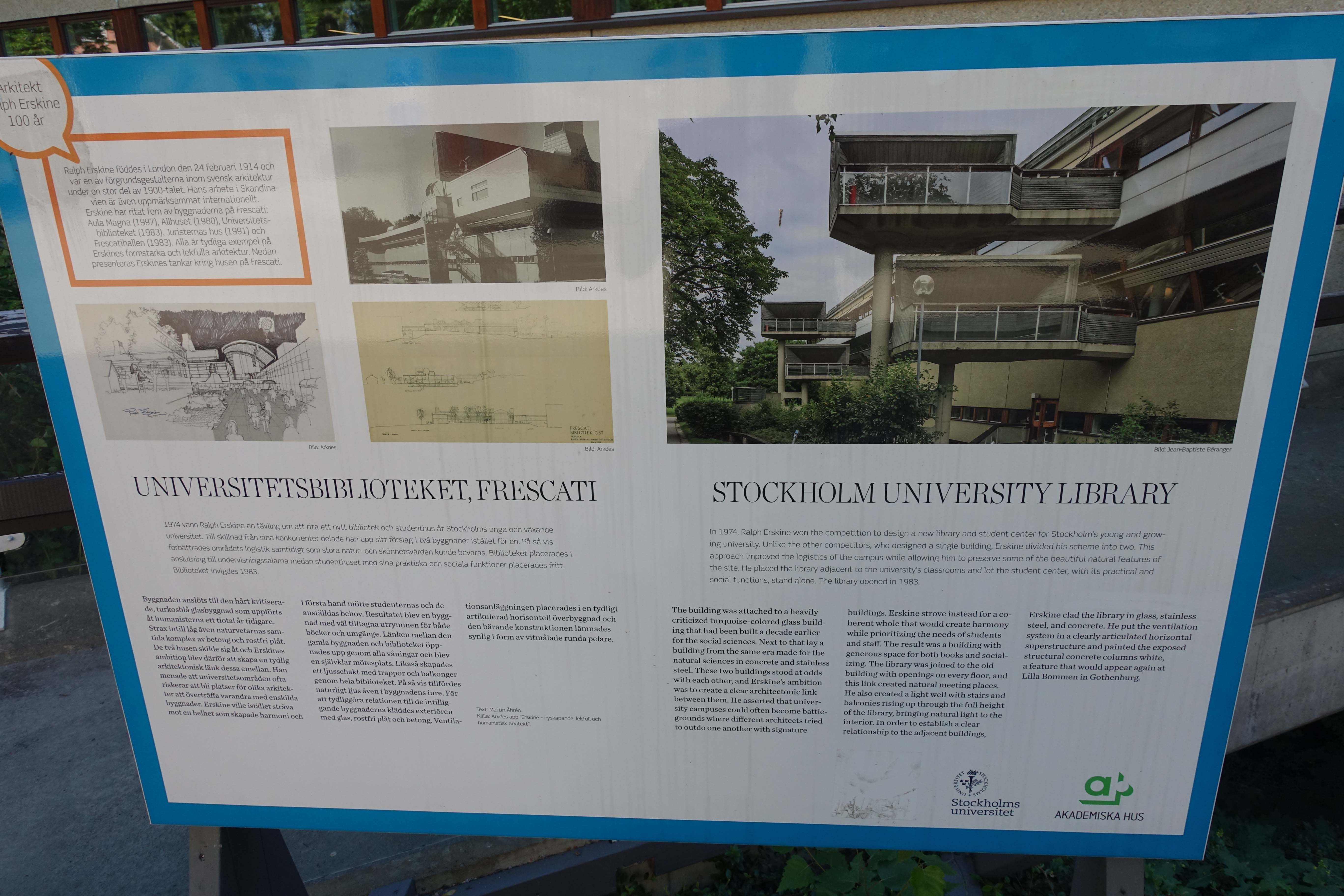
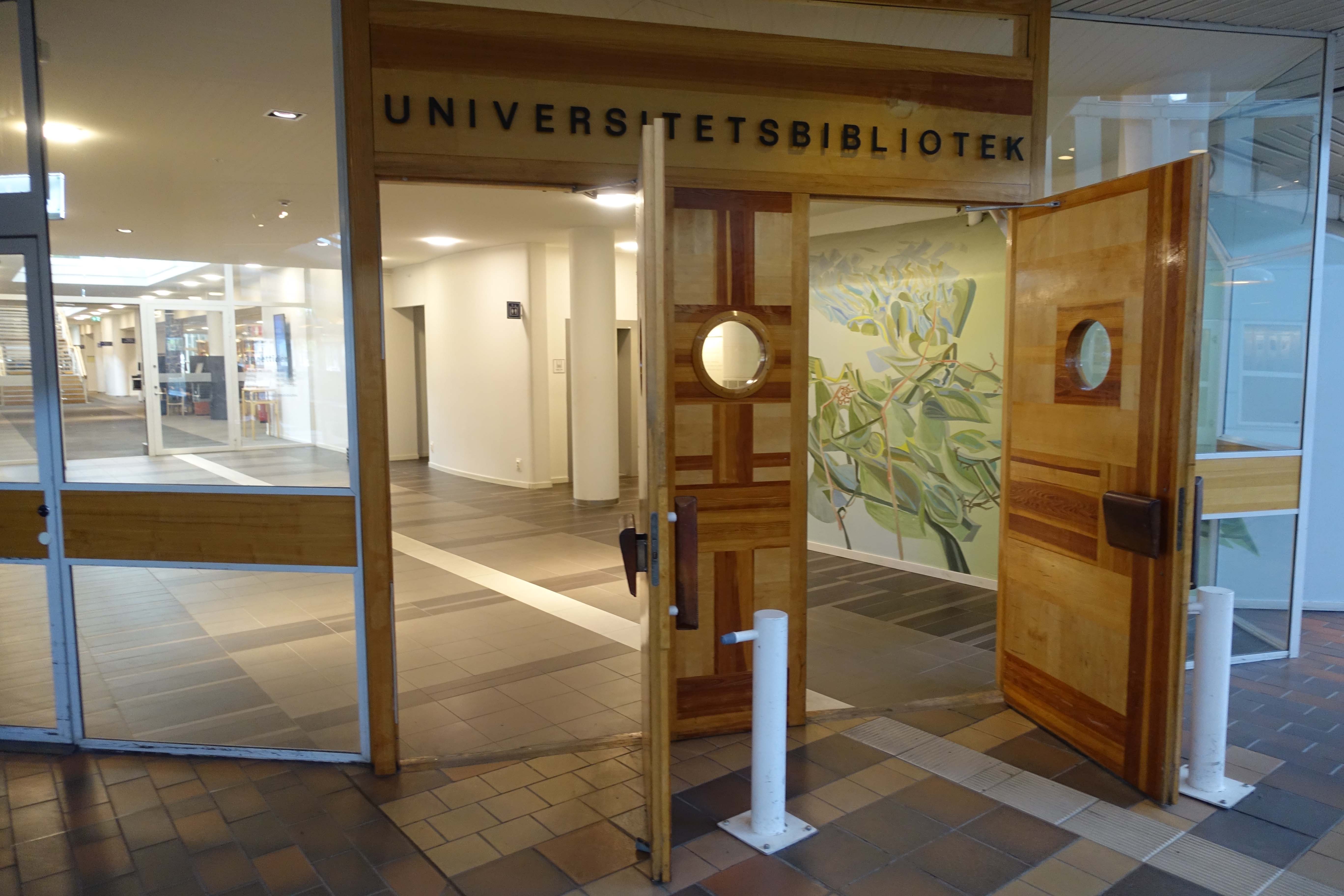
And here is the actual library, or “Universitetsbibliotek.” Apparently the building is quite famous, designed with thorough intentionality by Ralph Erskine. I found the exterior a bit wild, and the interior a bit wilder, but nonetheless all quite attractive.
Enter at your own . . . enlightenment?

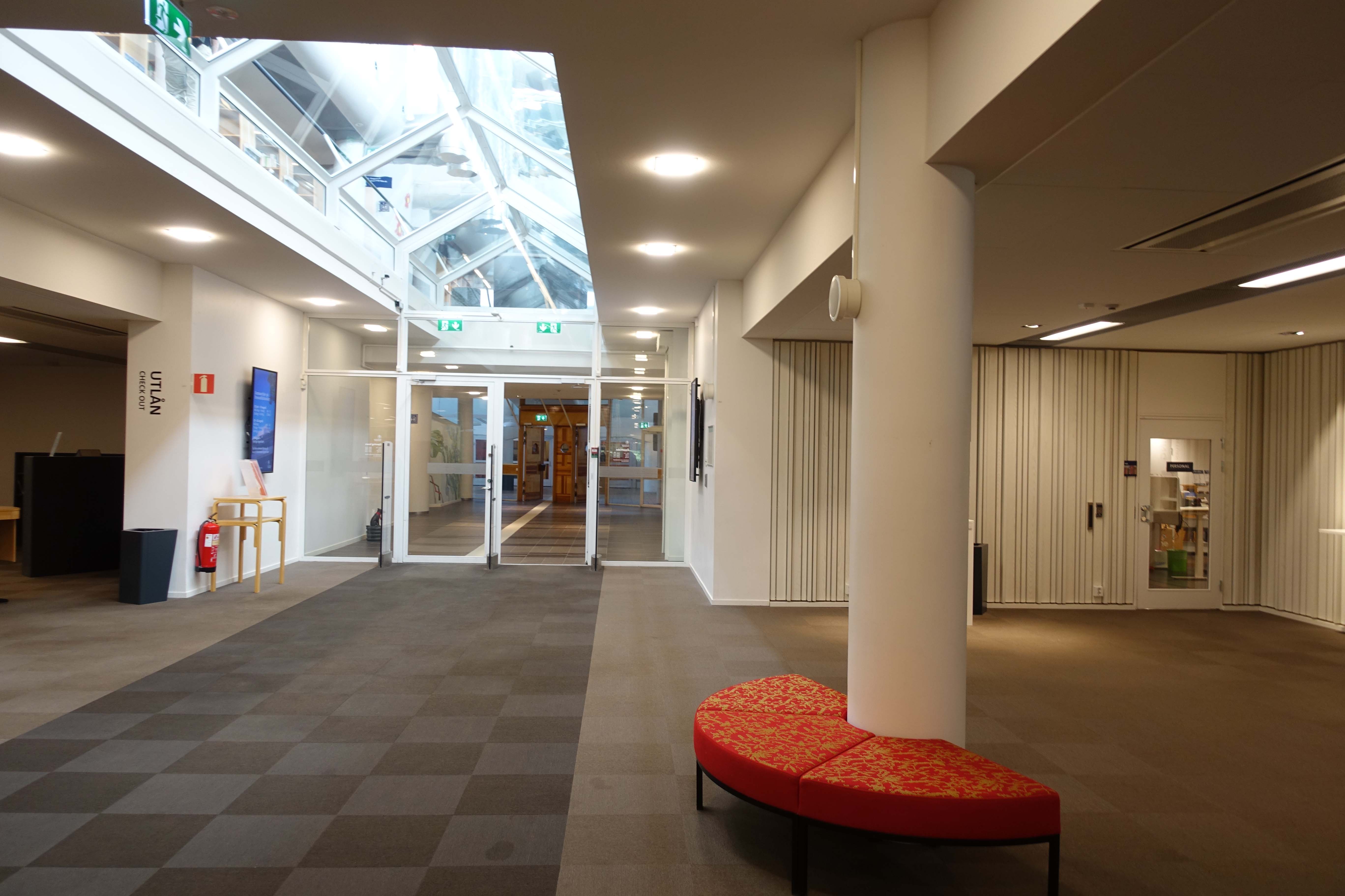
One of the first things I noticed about the library was the prevalence of the art. I would later find out is that the library intentionally sought artists from Sweden (via the university’s and the city’s collections) to contribute their work to be on display. Below: note how spread out the furniture and space appears. A minimal use of the opening space comes off (to me) as a funnel:
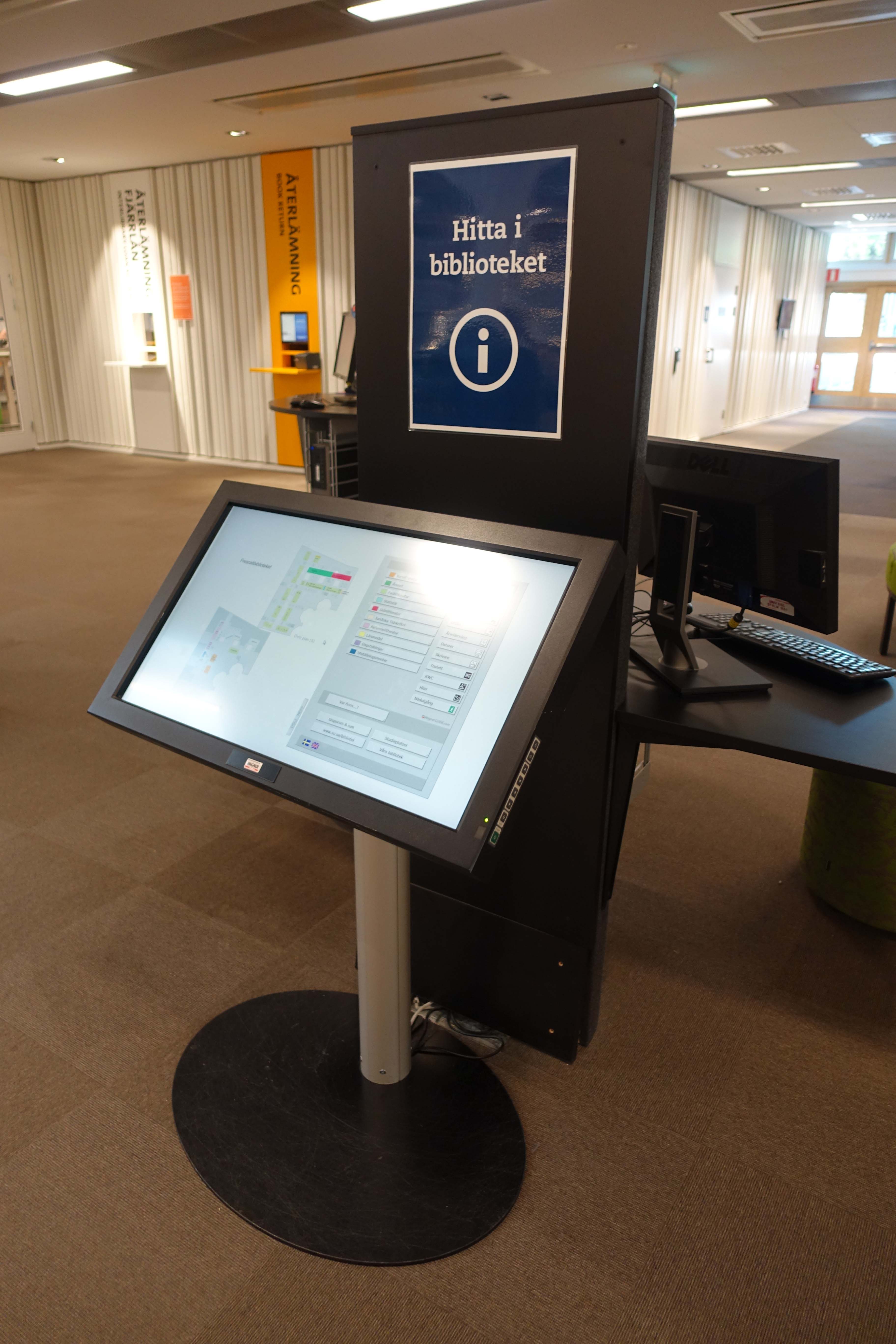
Another act of minimalism: a digital map/directory of the library:
Granted, the minimalism was exacerbated by way of summer hours at the university. As I would later be told, the library’s typically much busier. Still, note the standing zones and the minimal seating zones in this early section of the library, which may or may not curb the occupancy of the beginning spaces.
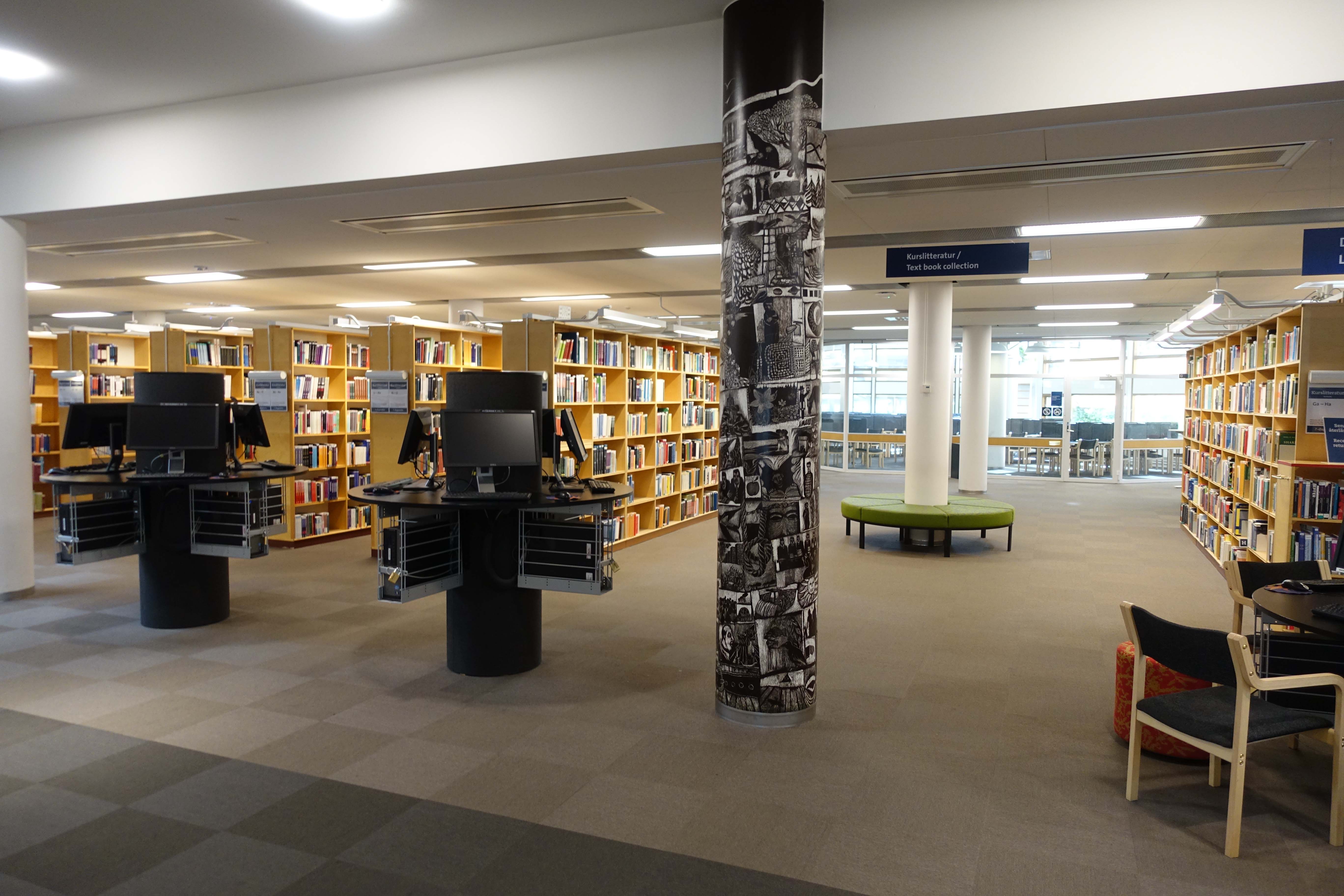
More indications of relative openness when it comes to space. Even the desks previously occupying the space were replaced with a more friendly and approachable furniture setup for conducting reference interviews and other interactions.
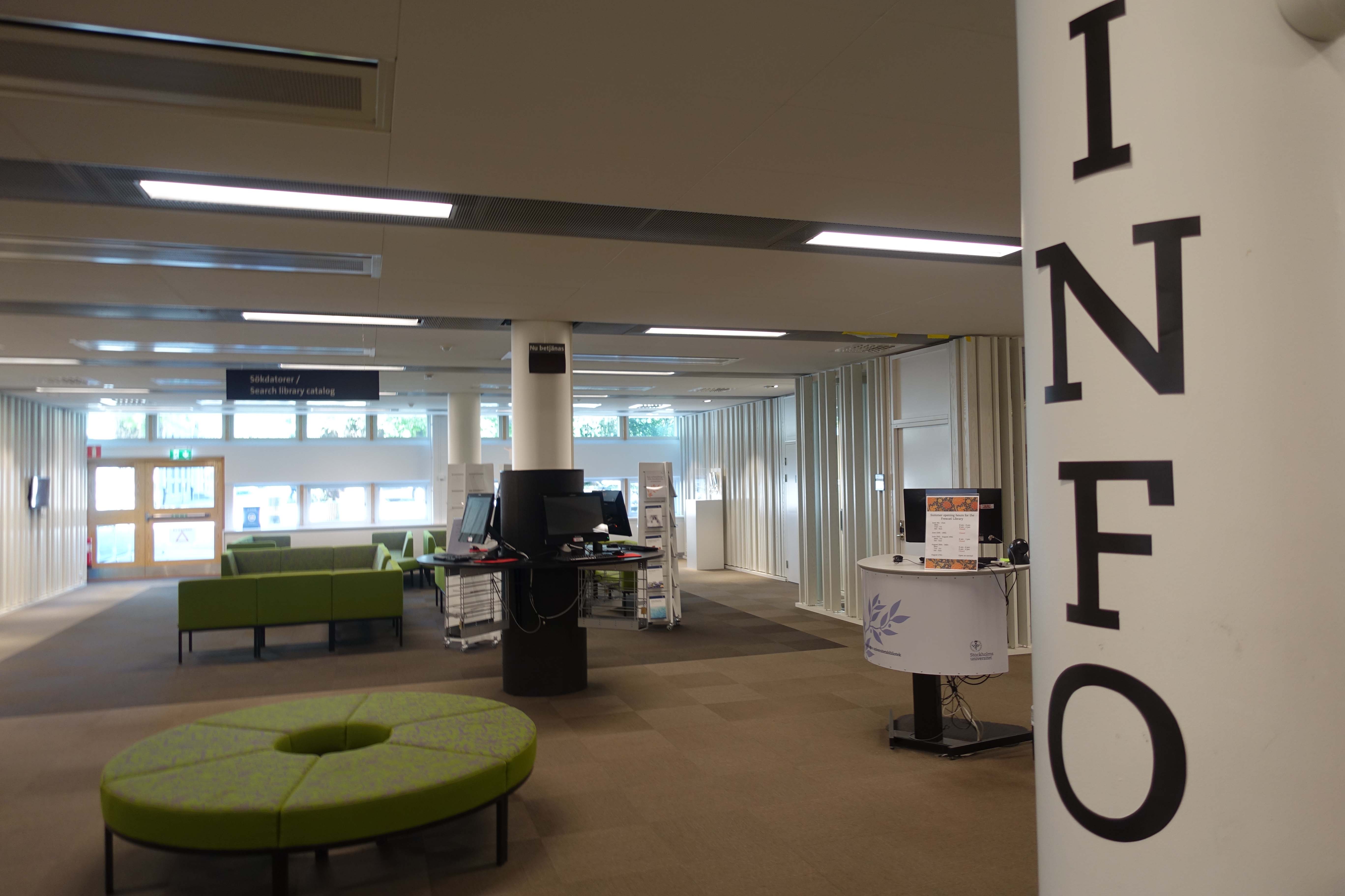
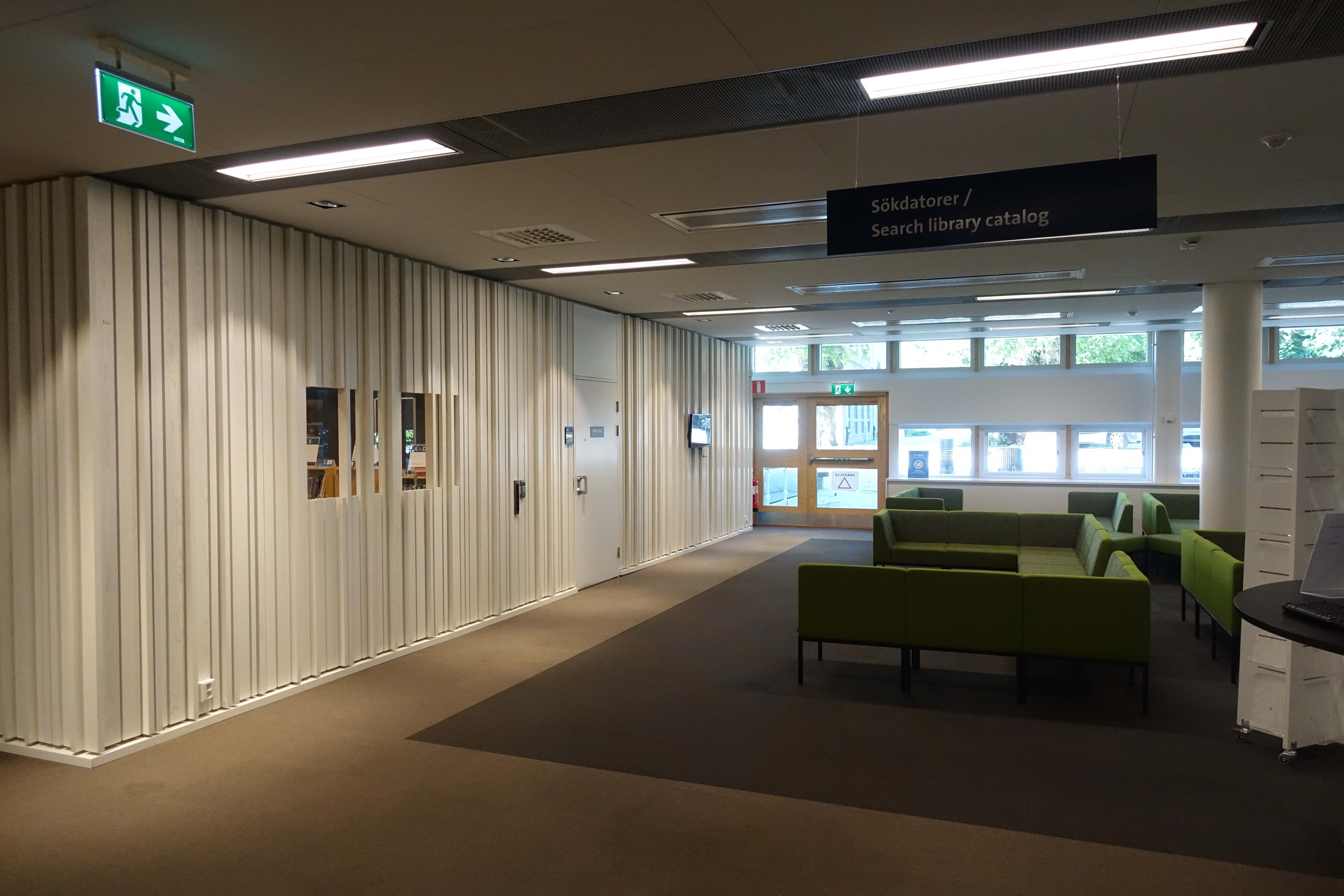
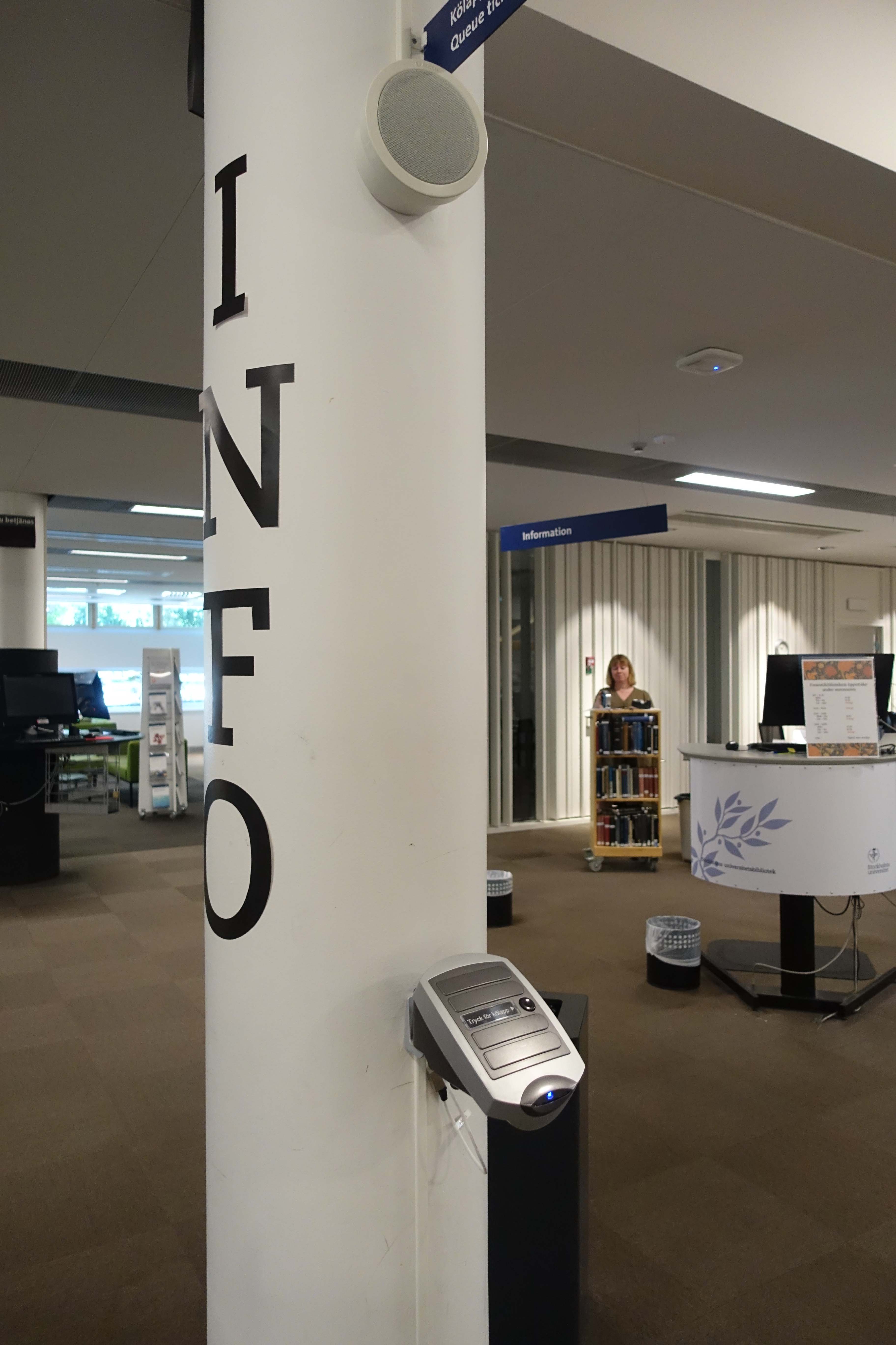 The strange walls are actually noise-canceling and absorb most of the sounds generated by folks using this space:
Speaking of tech services, though I didn’t get a grand tour of their work areas, in a mode of transparency, the building was designed to have a relatively open work space to show visitors exactly what is going on behind the scenes:
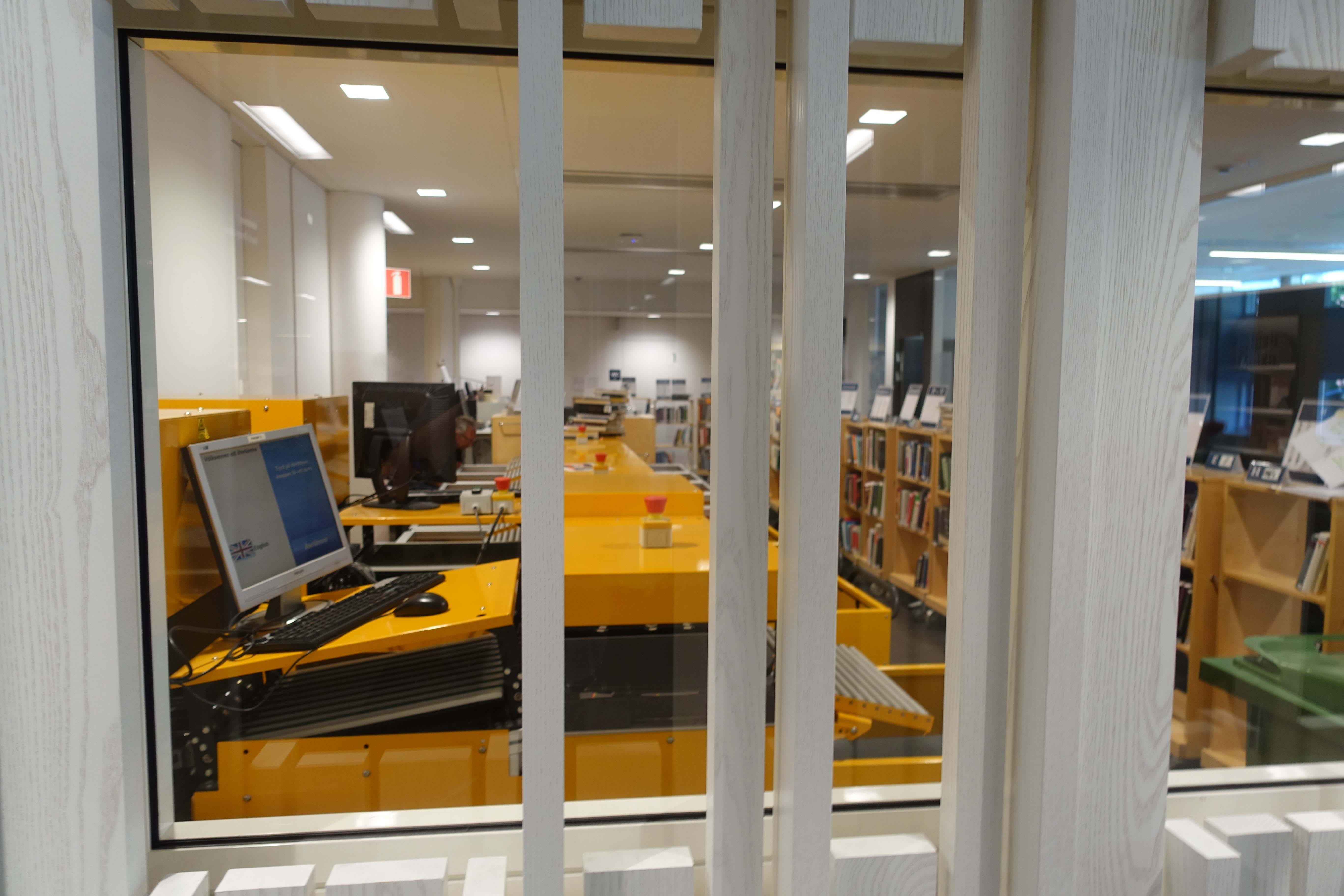
It may seem a bit wild, but the long table in the background is actually a work station for some of the tech services staff: 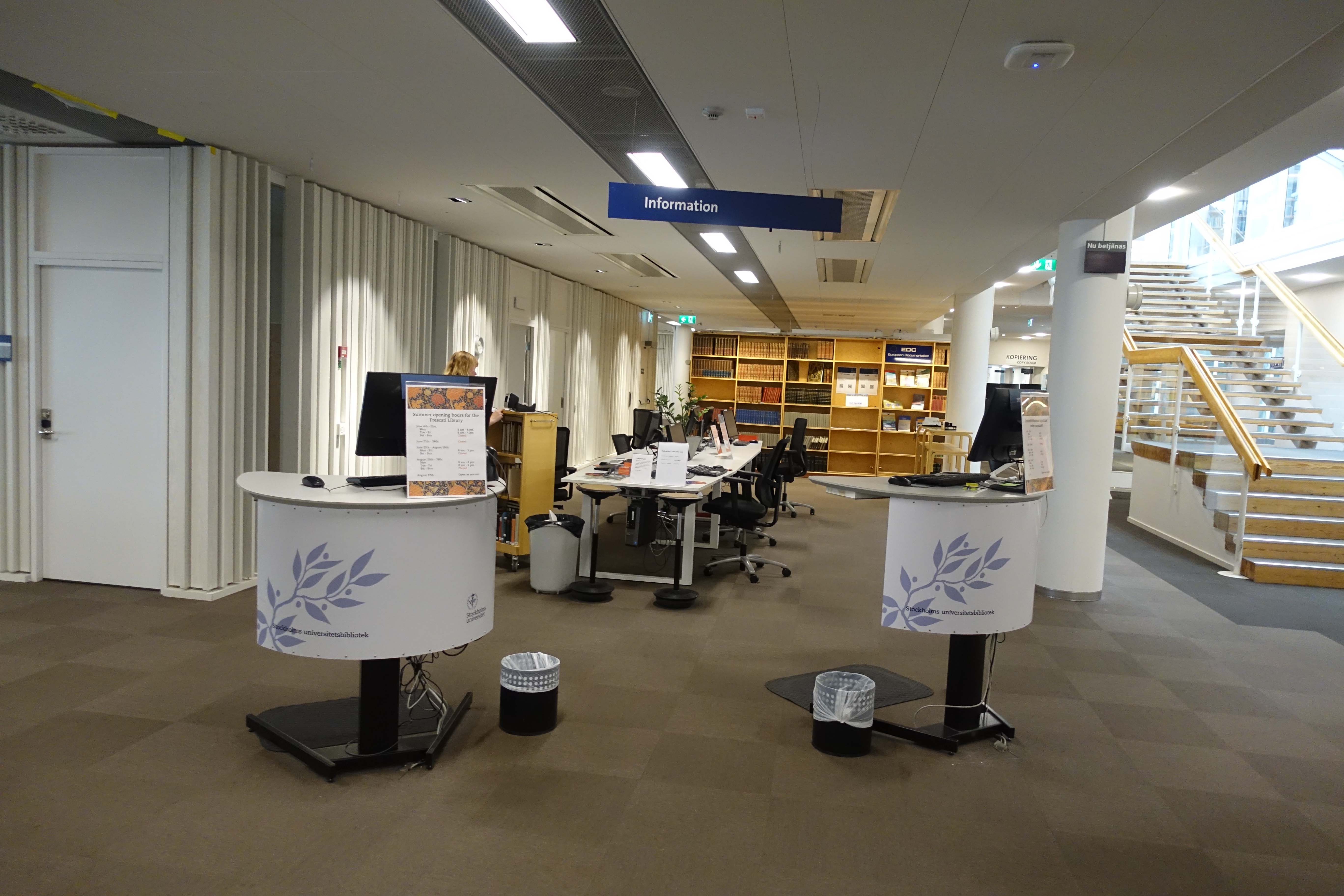
The library’s main floor includes a permanent performance space (which was unused and quiet during my visit):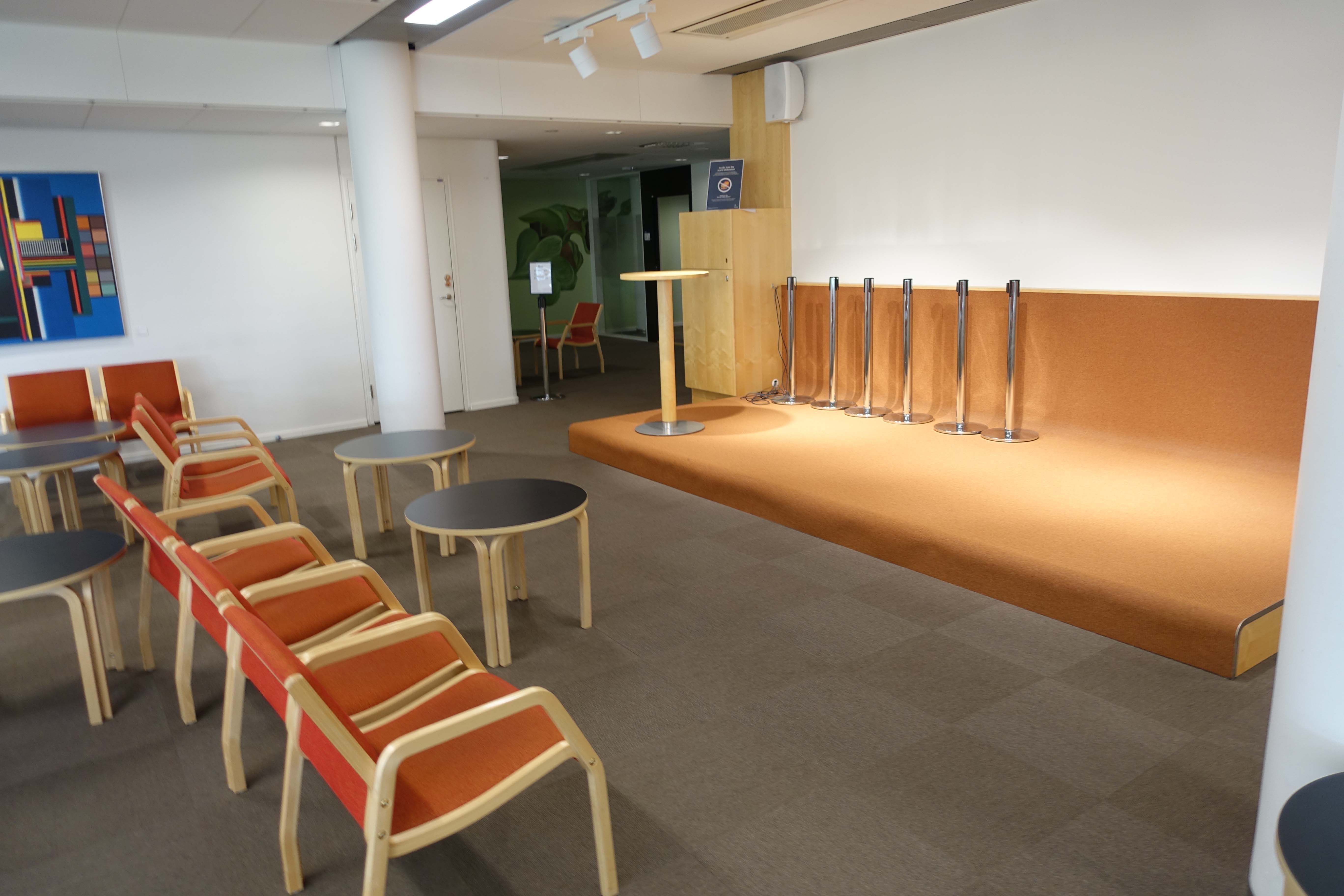 It was quite nice getting a chance to see clean furniture (which I haven’t seen in a while in a library):
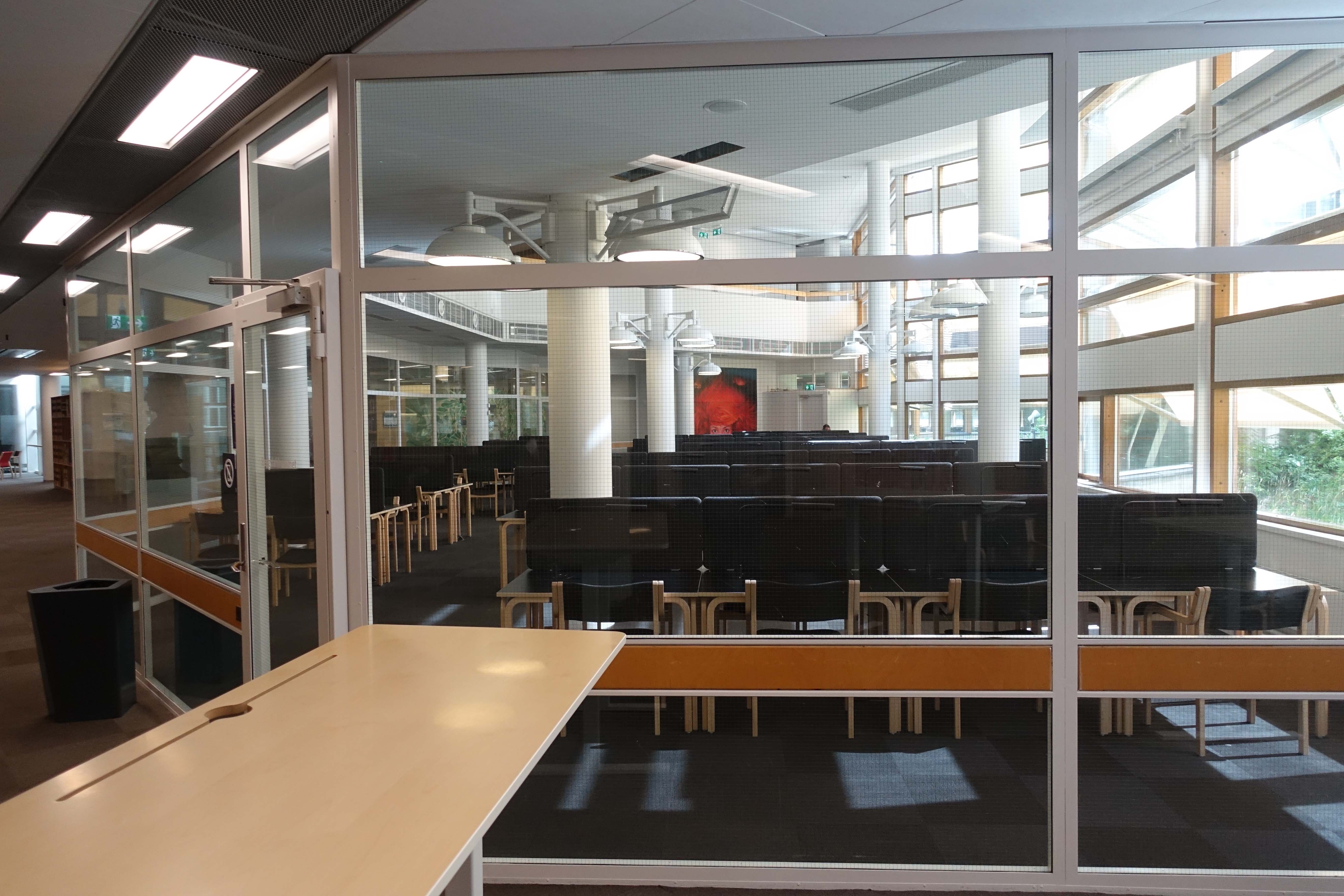
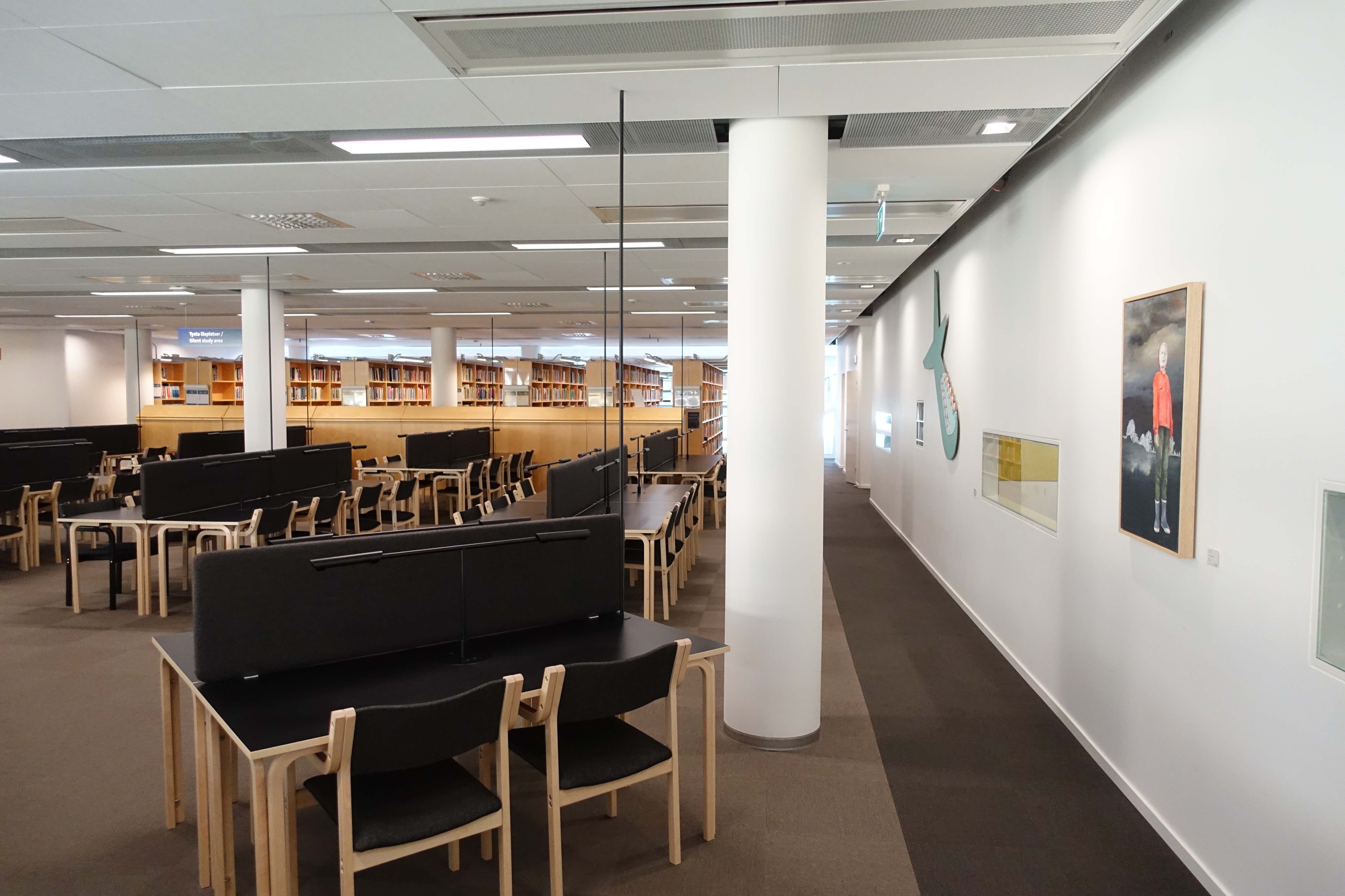
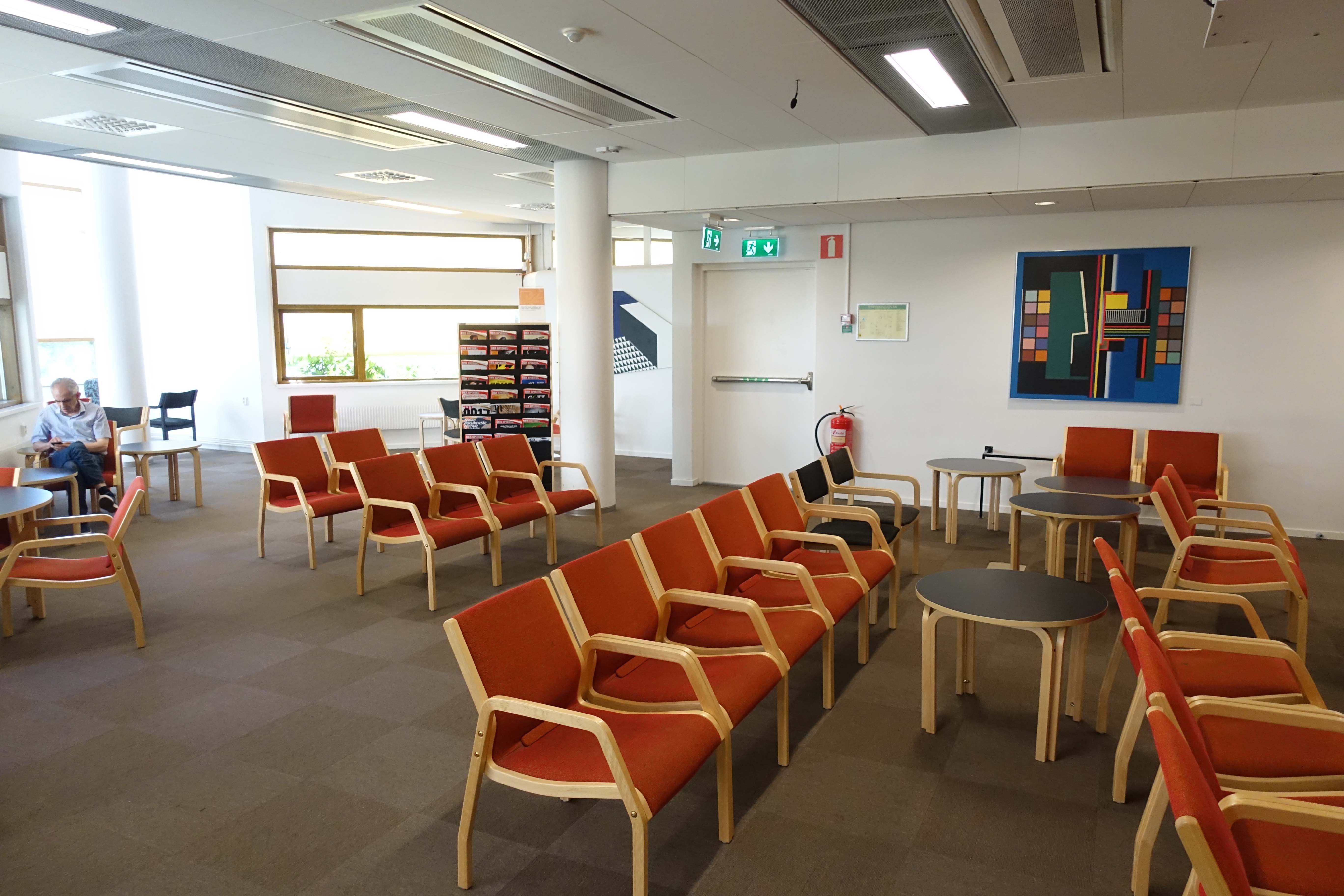 Just beyond the performance space is a walled-off area that contains a “silent study” space. I found it interesting that the entire space had cubicle-style work stations, but lacked computers. I suppose everyone brings their own computers to the library here, but it was just a bit shocking considering how many rooms in American college libraries do contain a plethora of computers.
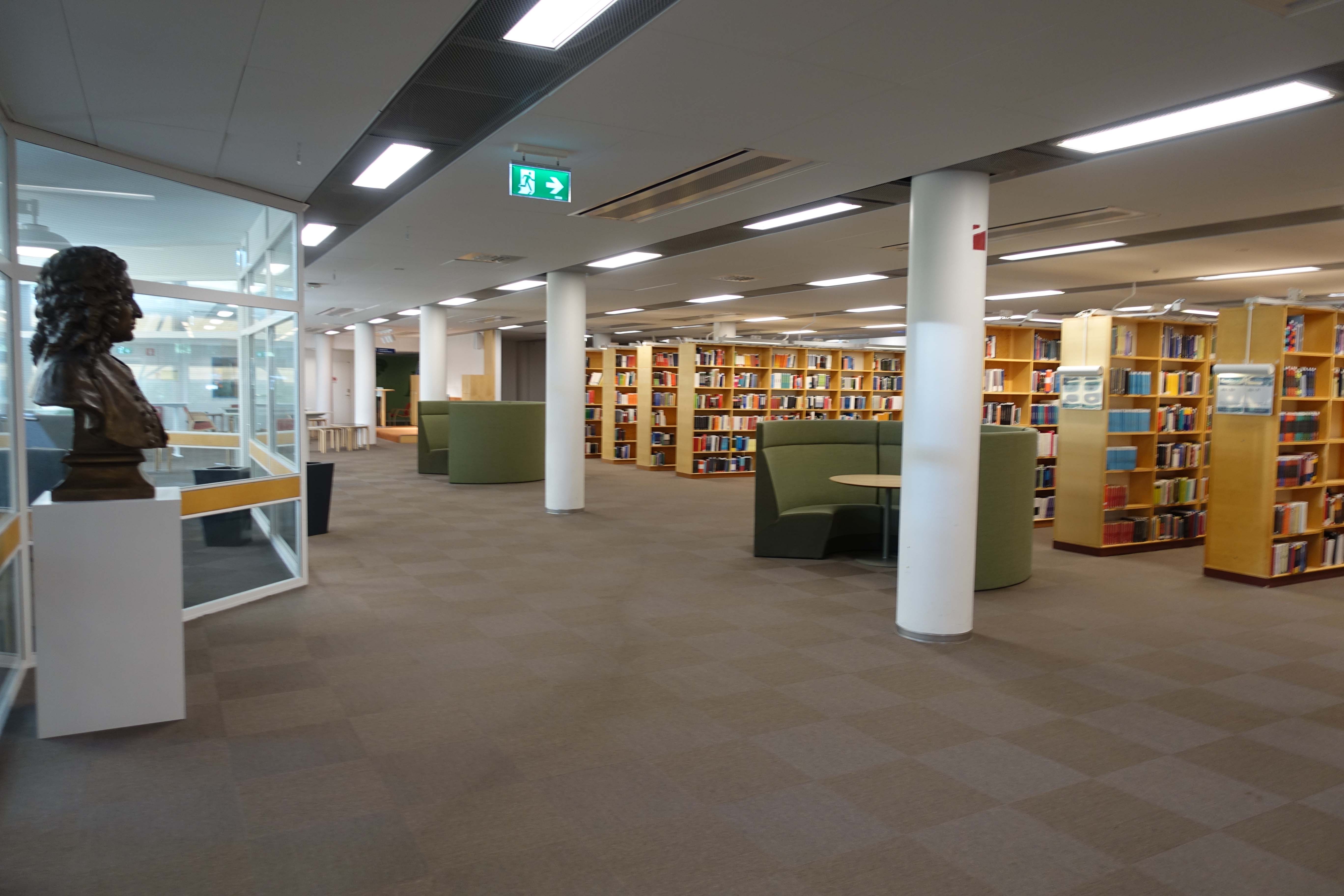
 Below: more open space. Note the green half-moon furniture, which was selected by students during a survey because they represented igloos. I found it a fascinating result from an otherwise risky assessment project!
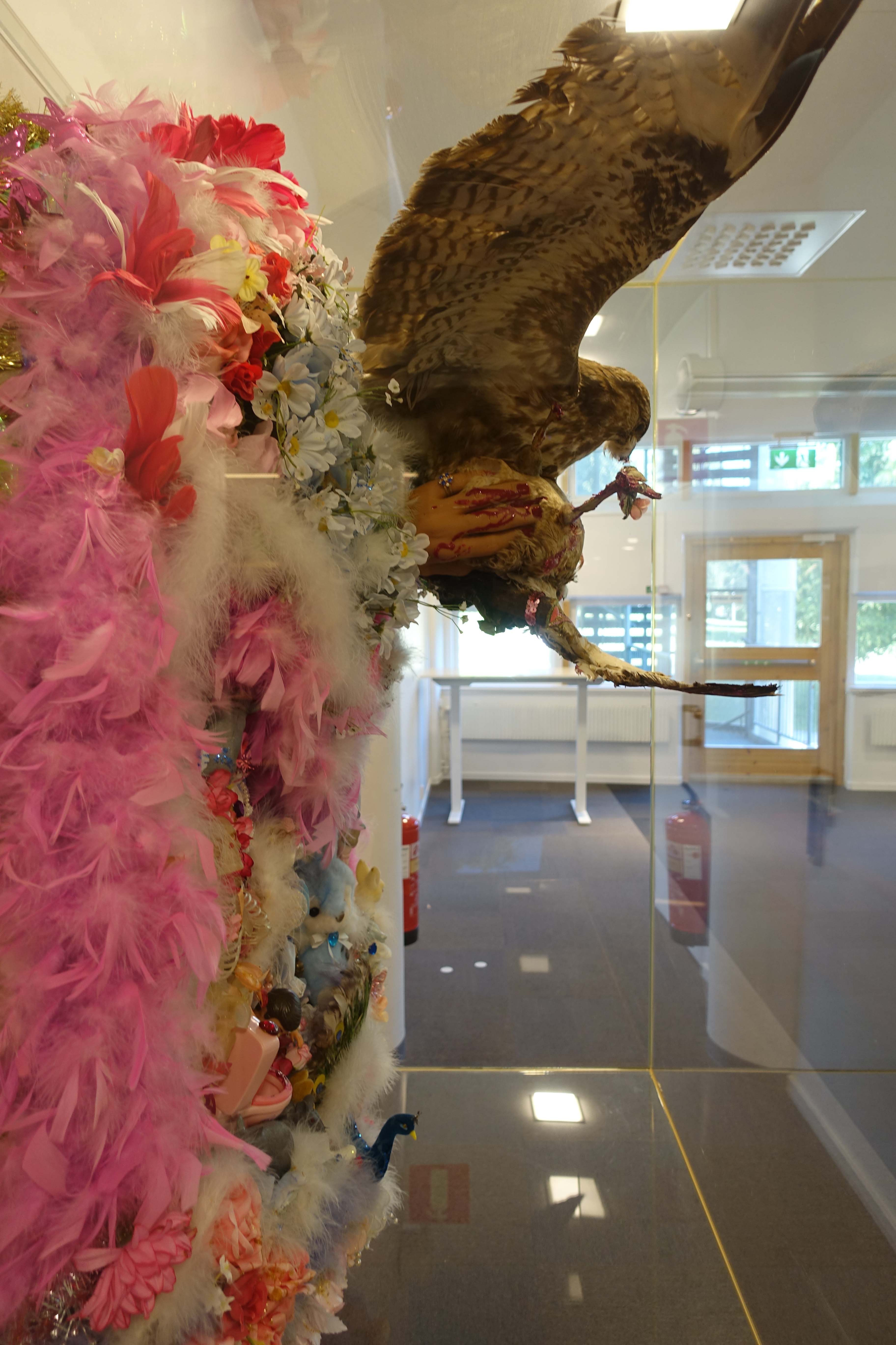
 The best artwork, in my opinion, was kept in the back, in an area not otherwise used. Though the library wasn’t afraid of having a gory sculpture work in the library, they decided to minimize the risk by keeping it in an area that wasn’t incredibly visible:
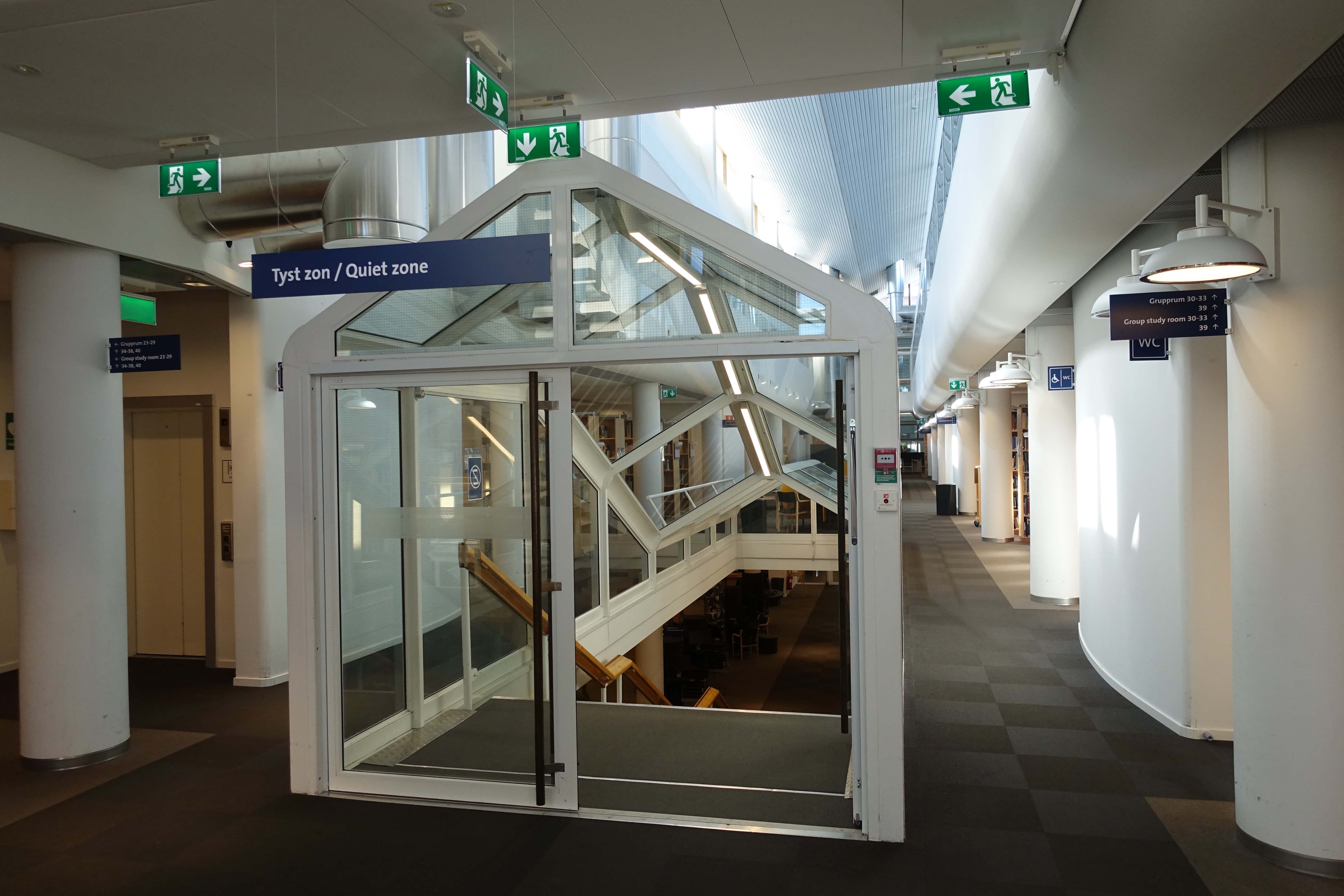
 In addition to the quiet area pictured above, the entire upper floor of the library is a quiet zone. Quite hilarious to me was the moment when I was being given a tour in this area by one of the librarians, and even though she was whispering to me, a student came up to us and asked to be quiet! I was actually taken aback knowing how passive folks in my own library tend to behave. Nice to see solidarity and responsibility by way of the patrons in this library, however!
 Some additional shots indicating the architecture and interior design:
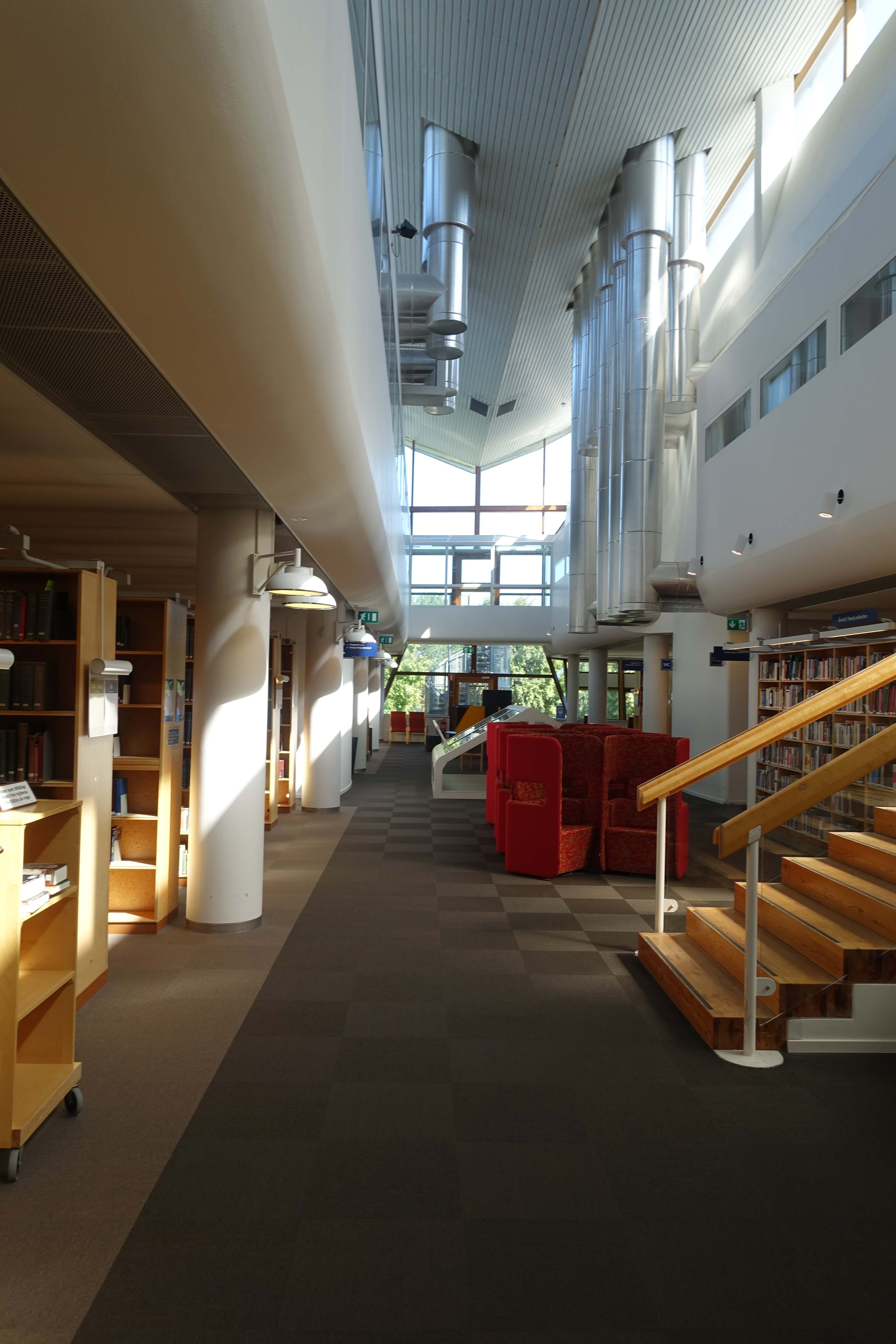 Arguably one of the most confusing pieces of library furniture I’ve ever seen. You know, I probably should have tried to sit in these tiny work stations and addressed their comfort directly, but I didn’t think of it at the time. Now, looking back on it, I’ll always wonder if they are as uncomfortable as they look.
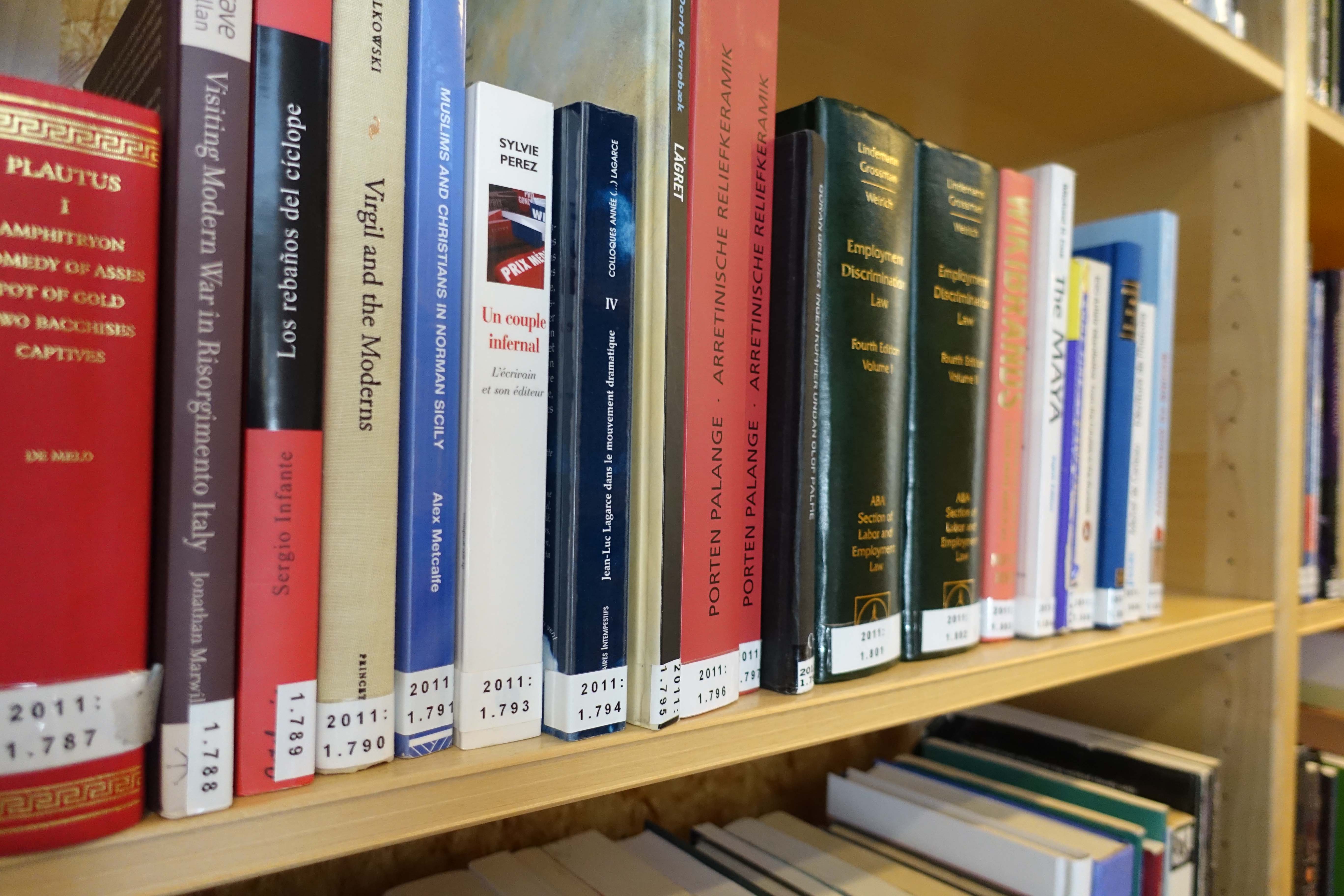
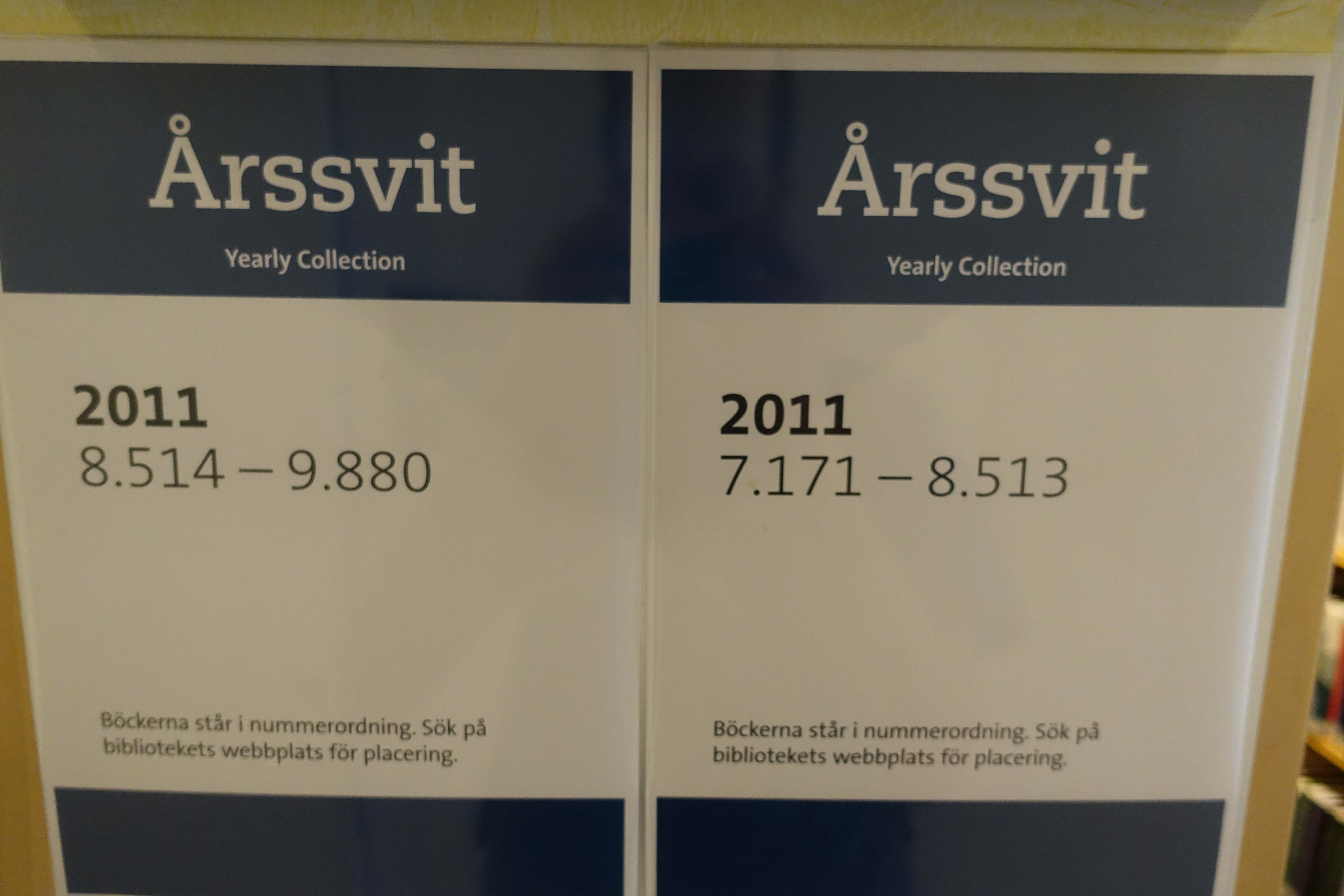
 Perhaps it’s a bit commonplace and I’m just ignorant, but I found their shelf arrangements and classification system (based on acquisition date, organized in sections by year of acquisition) to be quite unique. Because of the seemingly random results in how items get displayed, it requires the community (maybe “forces them” is too strong a phrase) to learn how to use the catalog. I imagine most librarians would have strong feelings about the extreme pros and cons of this system.

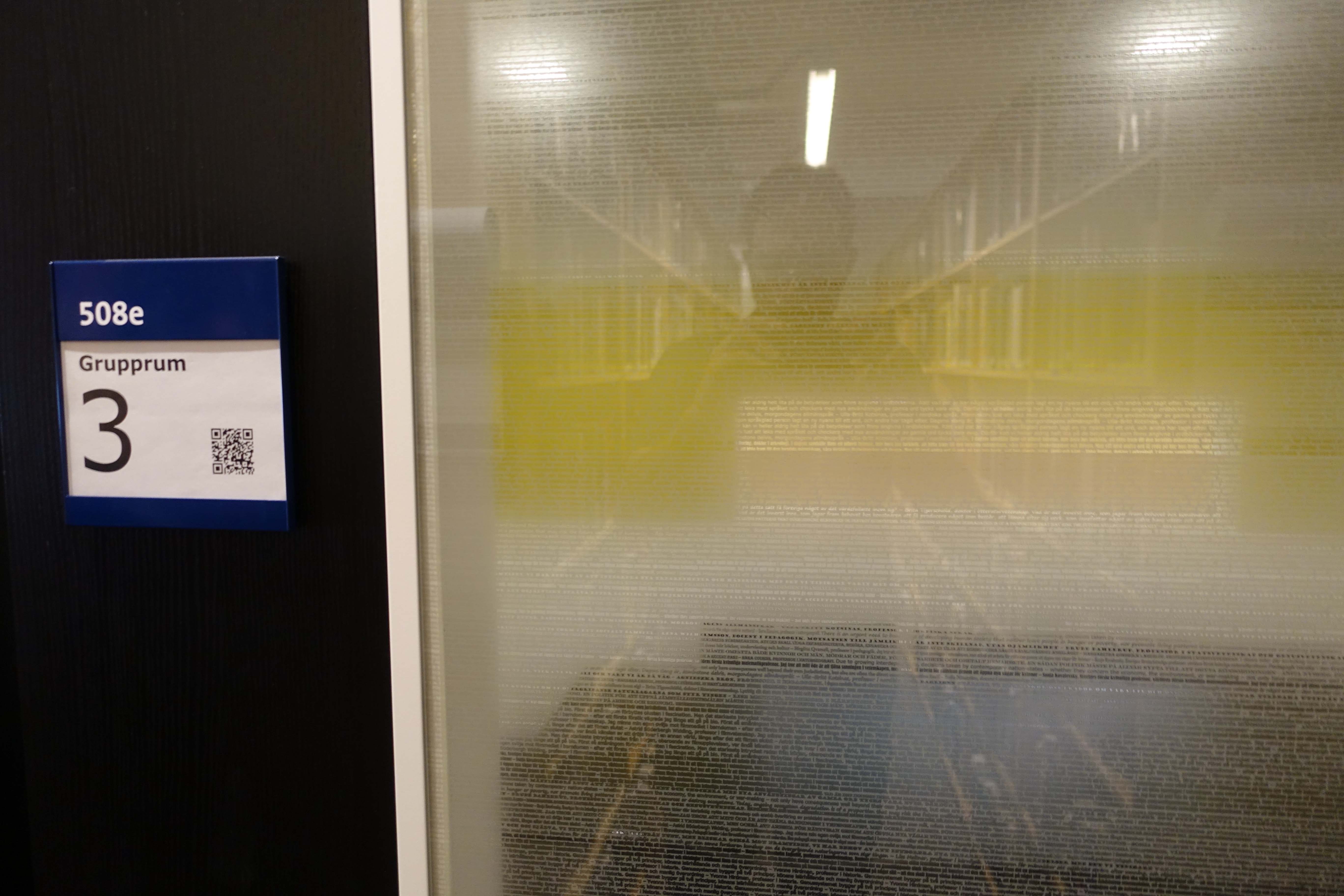
 One of the most memorable images from the Stockholm University Library is the study room and other office windows, which are tinted by way of text, all of which is taken from books by Swedish women! Go feminism!
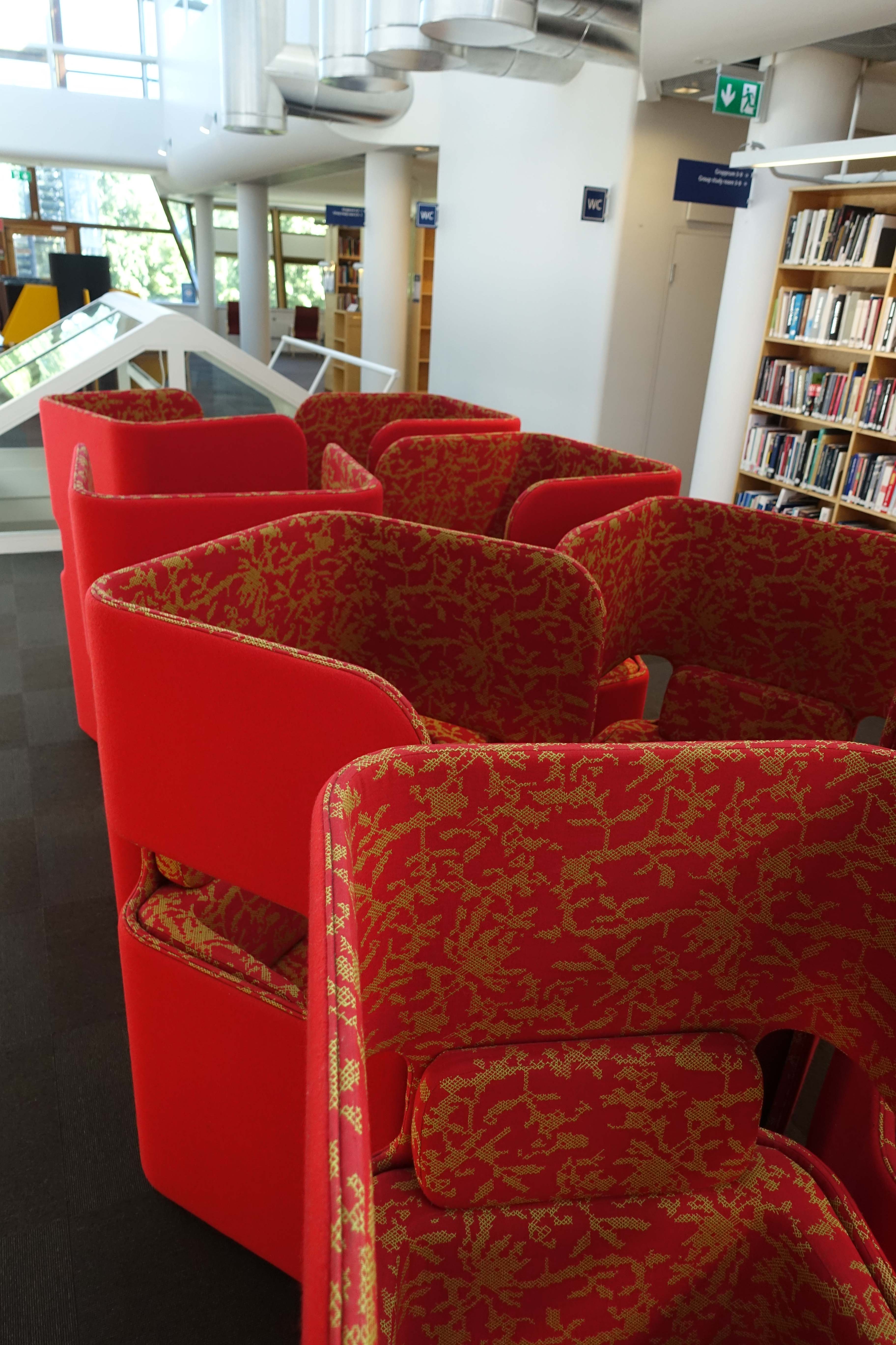
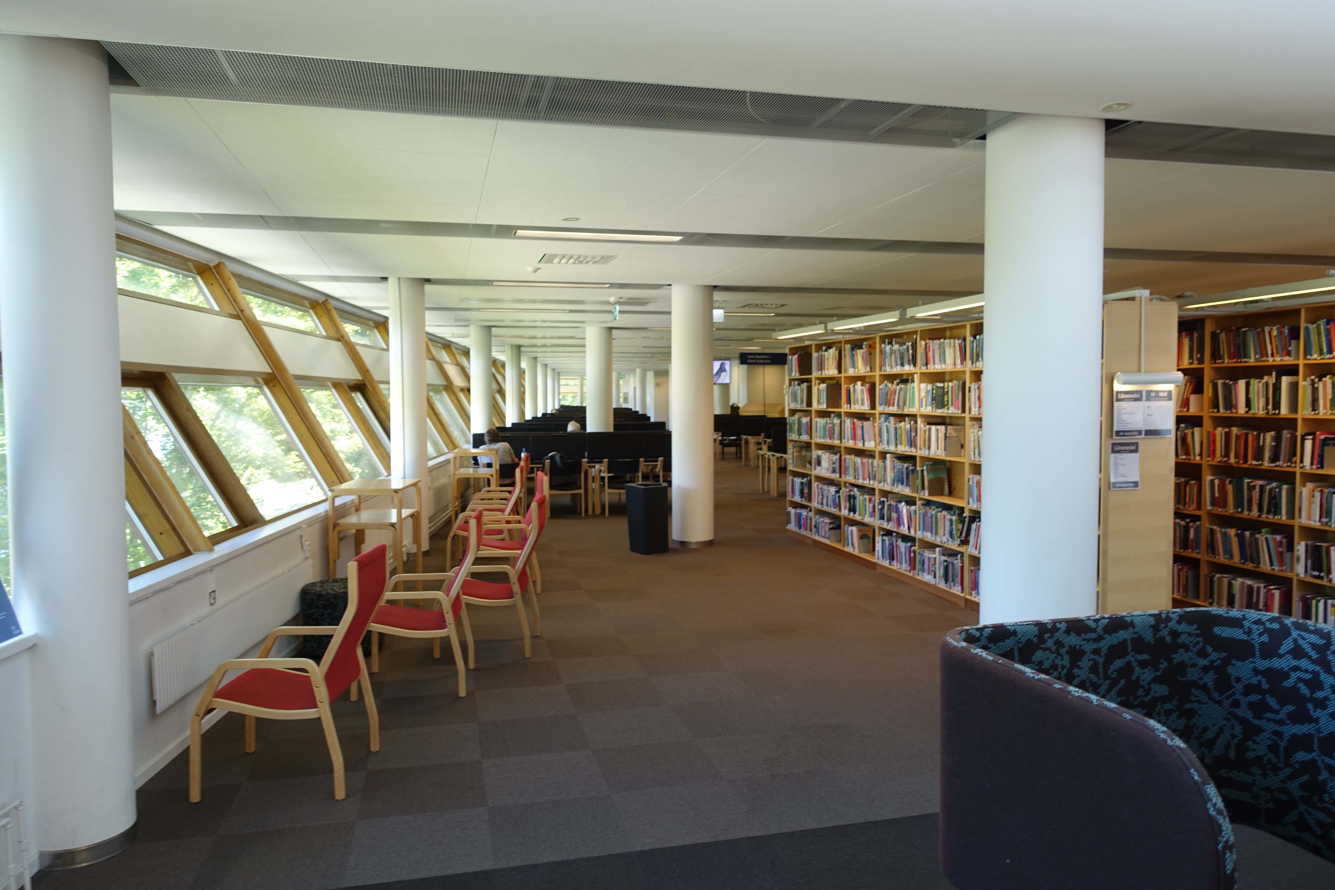
 A few more shots from my meandering through the library are below. Note the immensely large windows with access to the green space just behind the building:
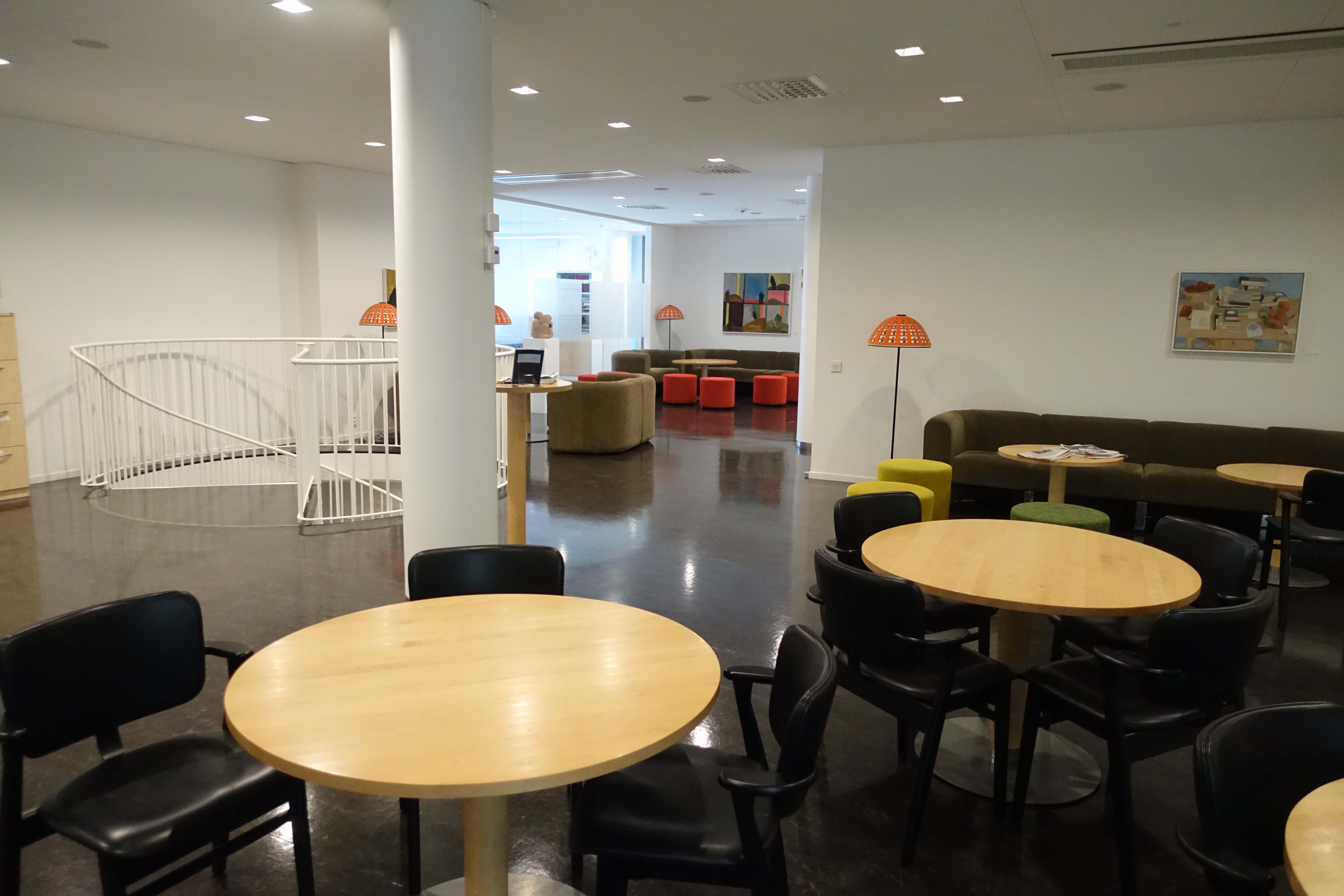
 It’s almost like being in IKEA. Note the lamps that look like tiny umbrellas, and the spiral staircase so casually off to the side. This is the staff lounge area:
 And the staff conference room that can be opened up to the public for any particular event:
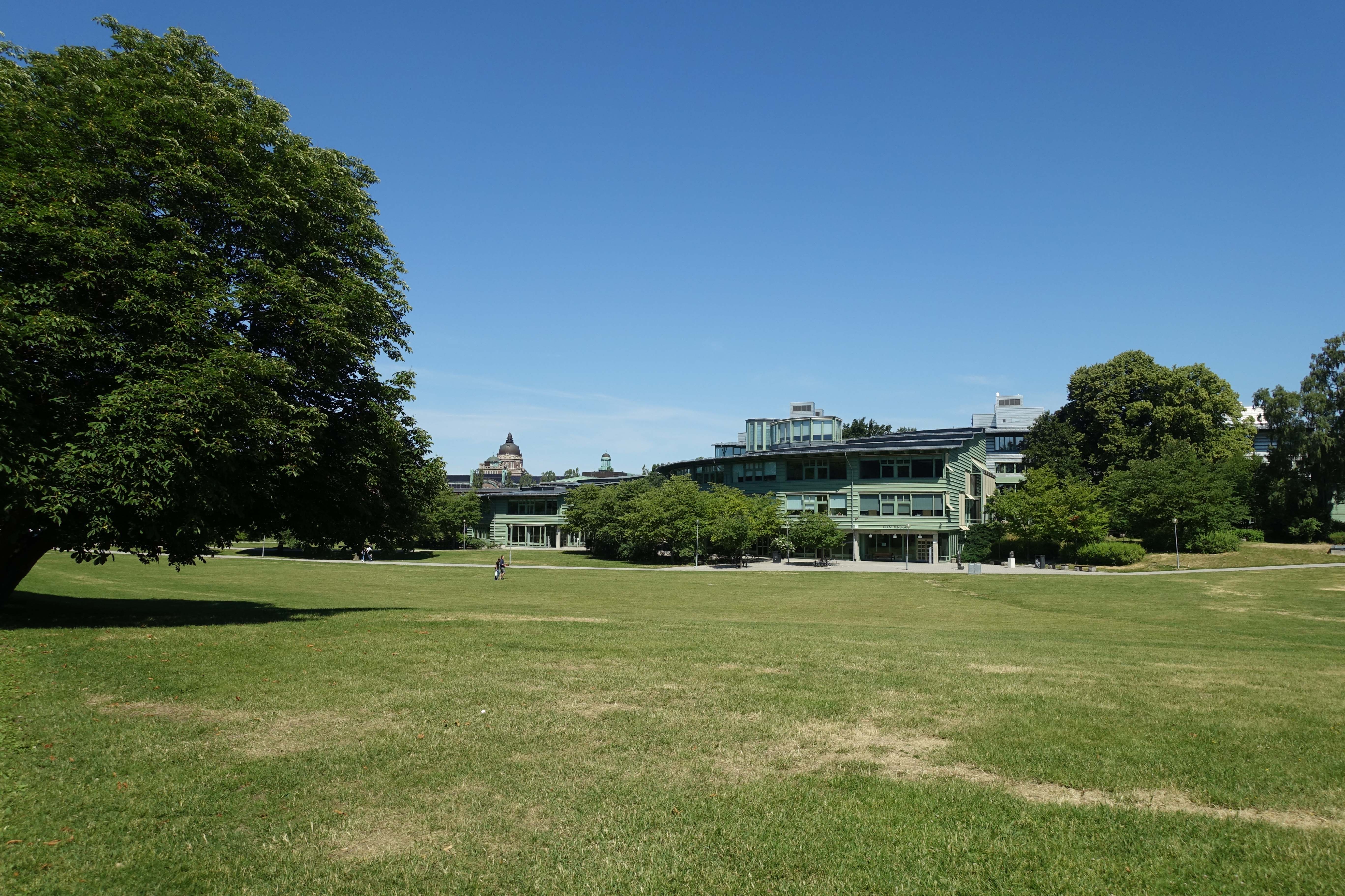
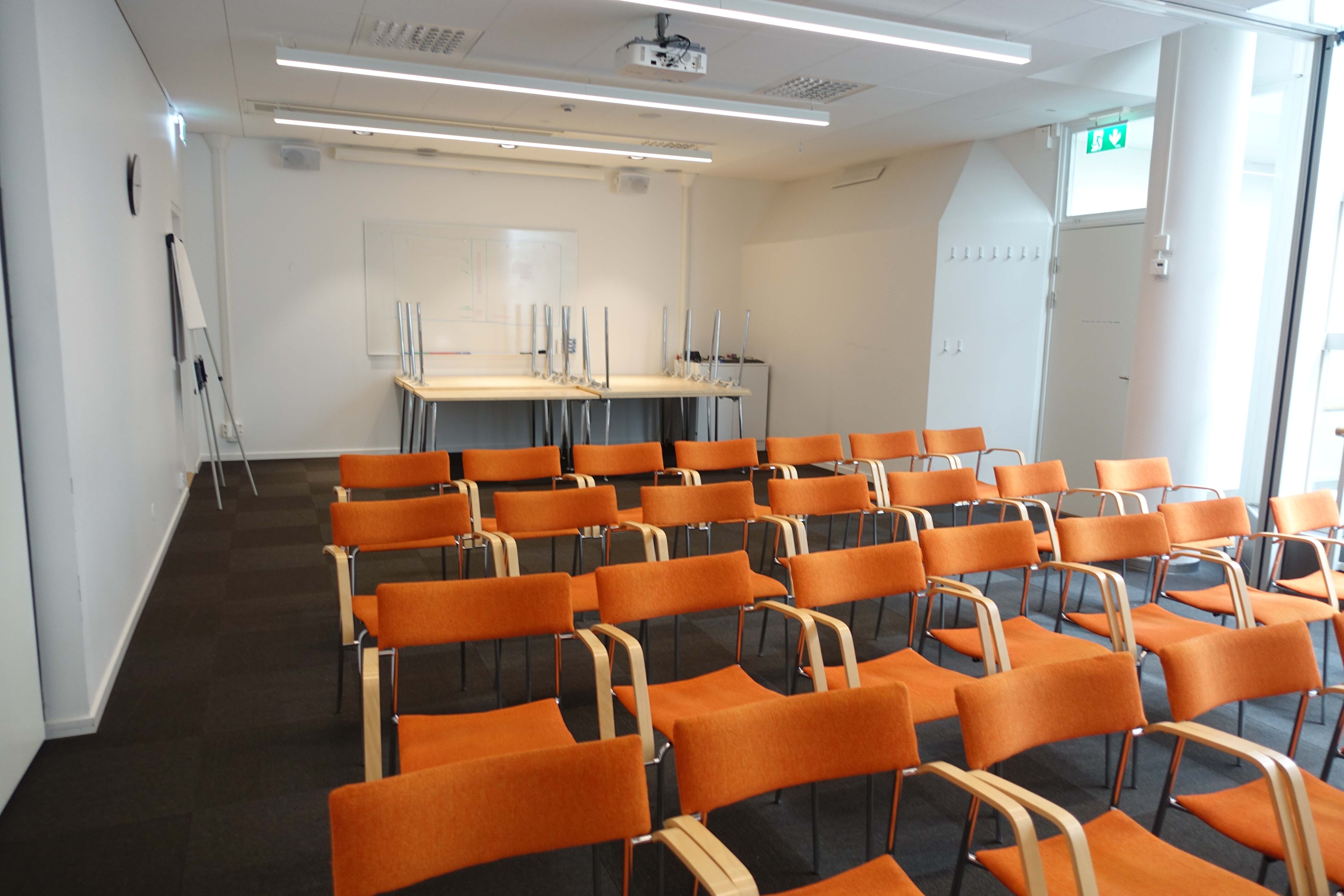 Following a tour and a relatively lengthy (although also exhausting) conversation with the director, where I was able to learn more about the network of universities in Sweden and ask slightly more complex questions on the history and organization and operations of the Stockholm University Library, I was thrown back into the wilds of the campus, where I took a few moments to explore and take photos before heading back to my mother. I did enjoy the exploration, even in the heat of the summer, and I would have loved to spend even more time exploring the campus (particularly when school was in session). For now, this visit really was a preview.
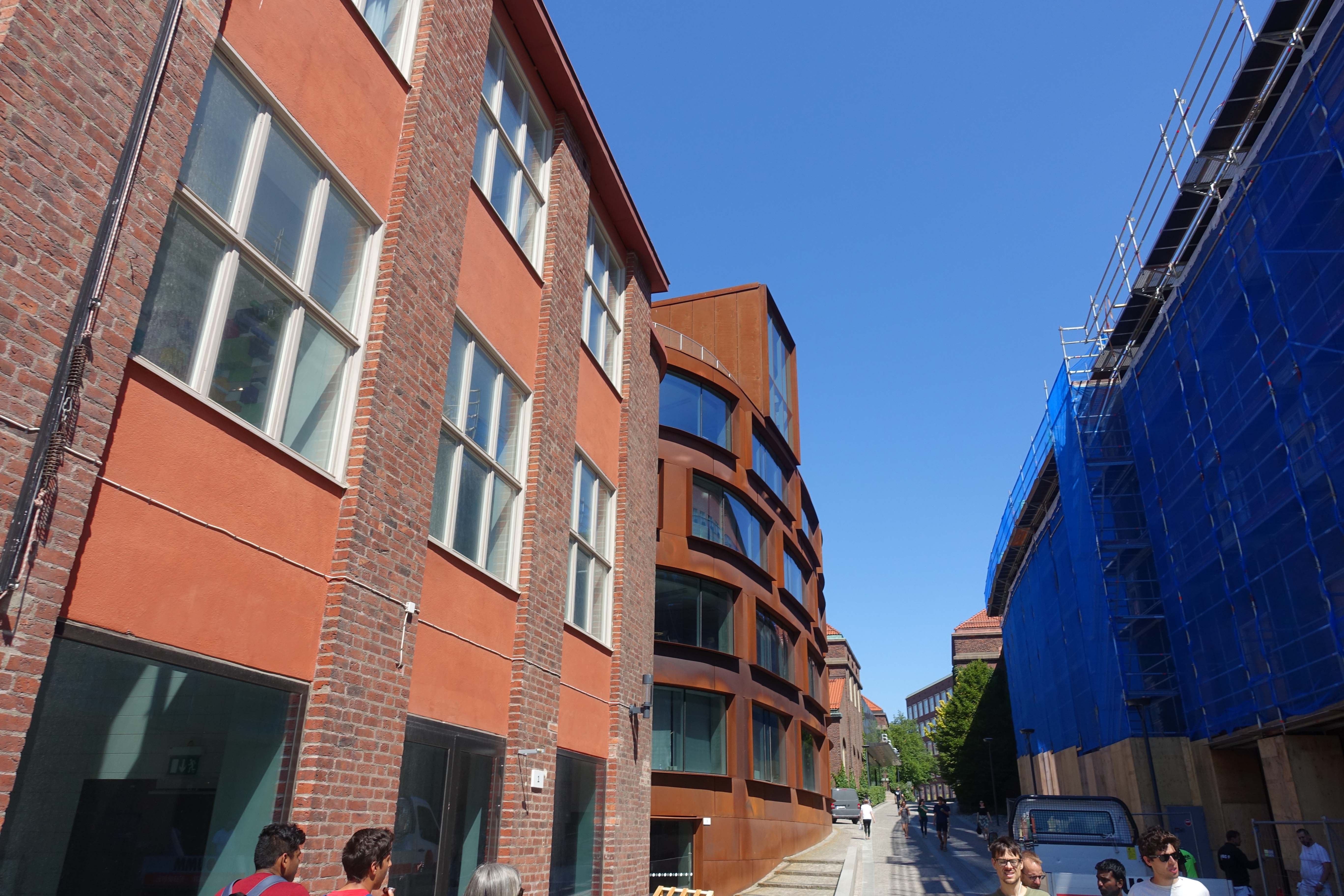
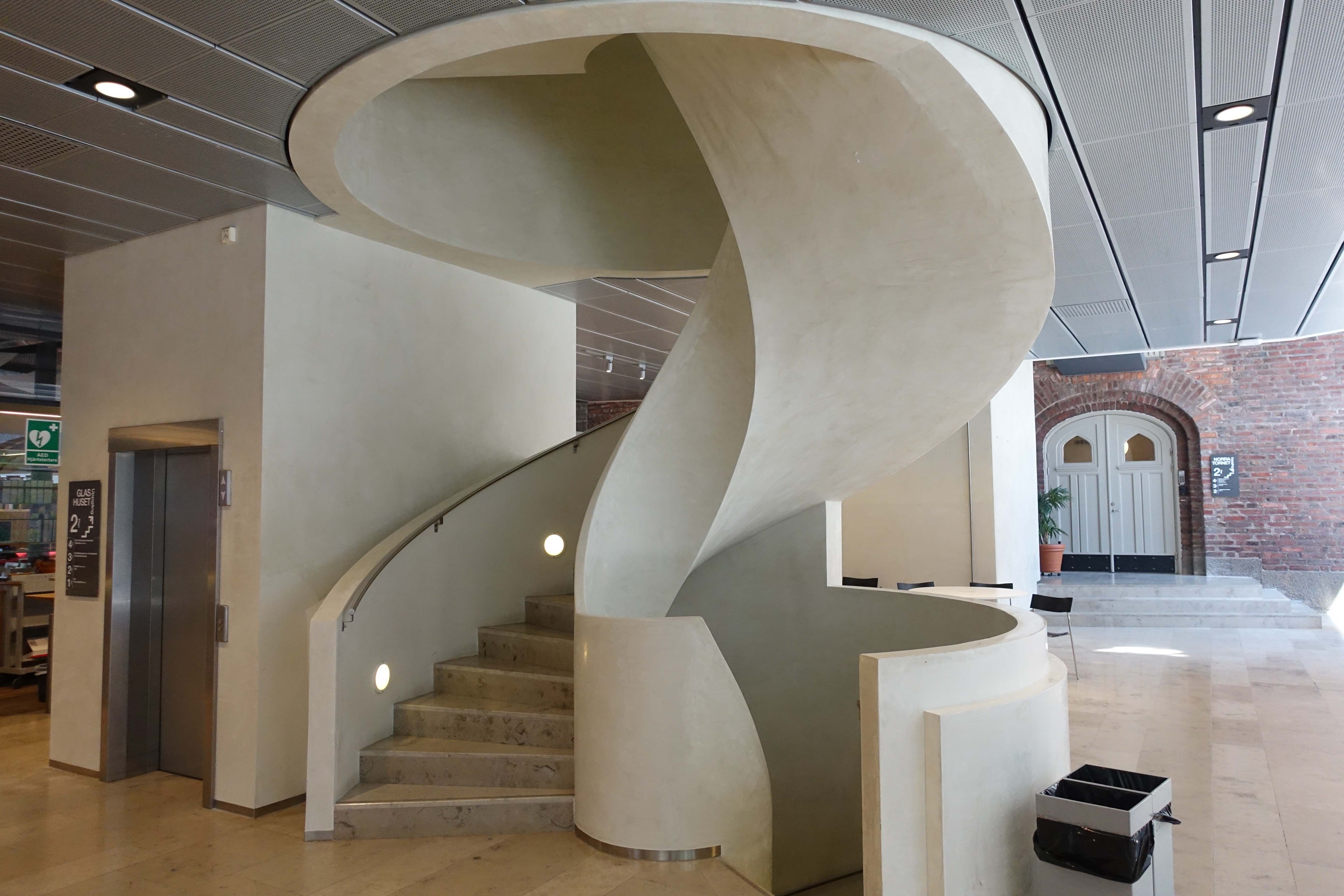
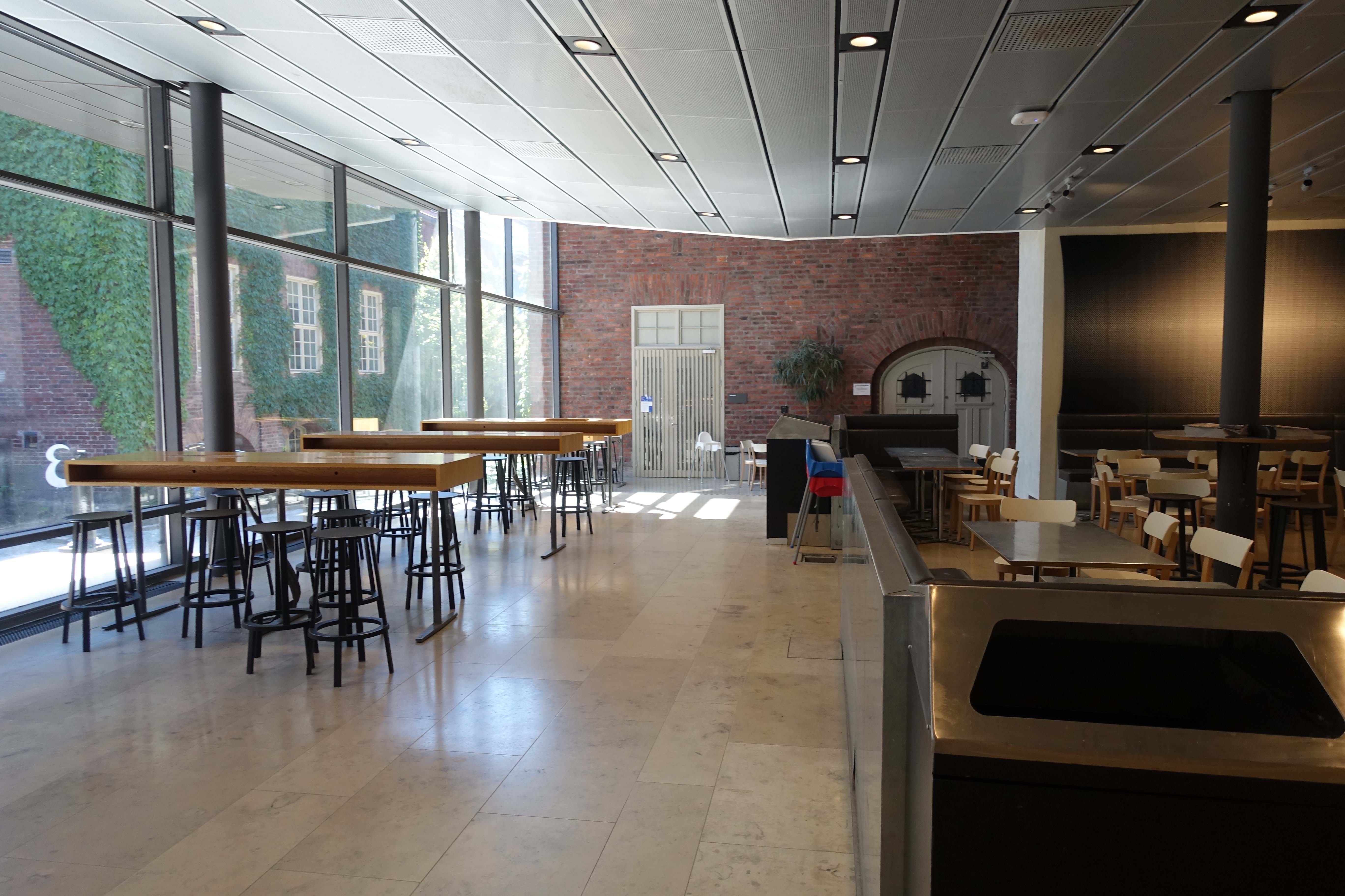
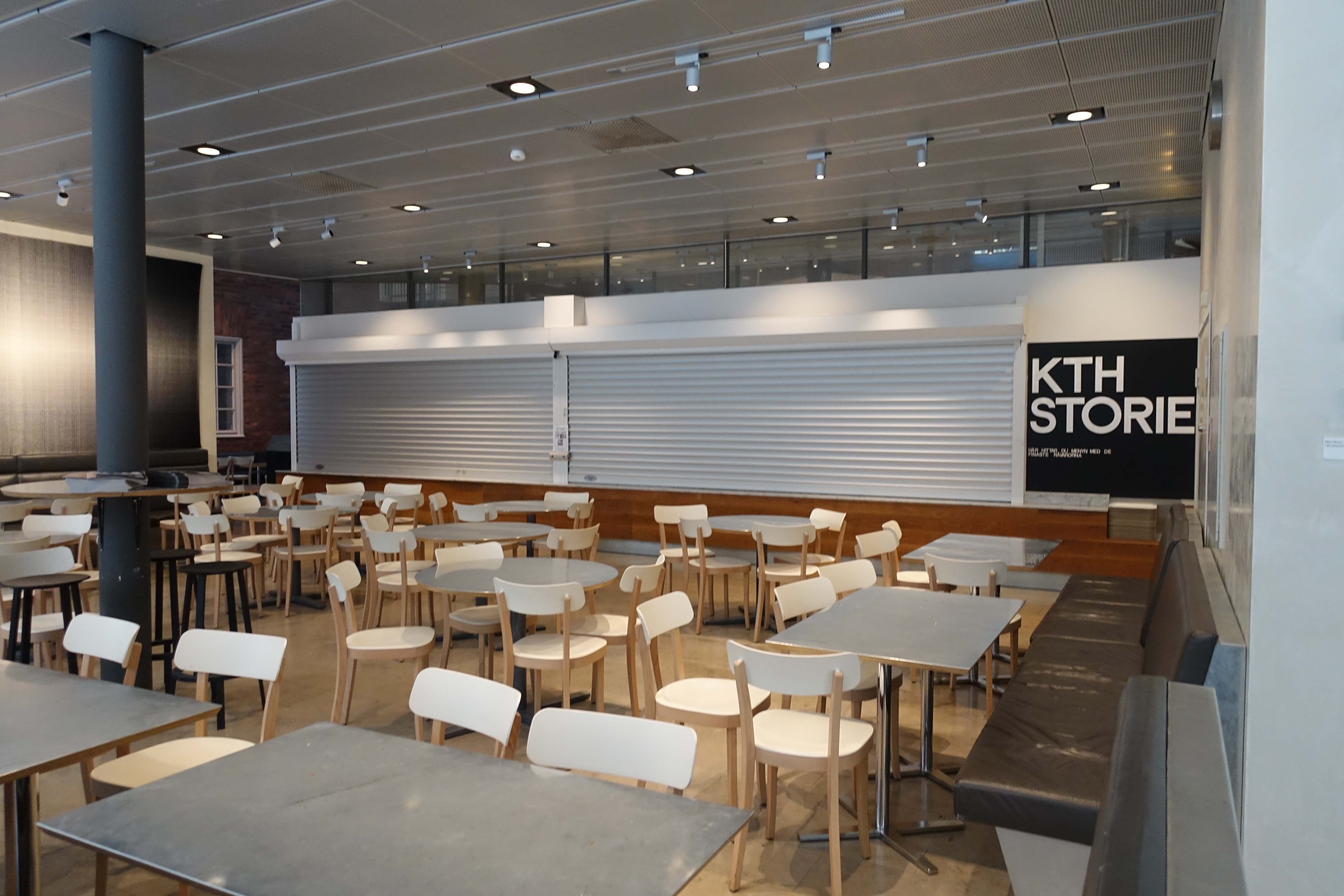
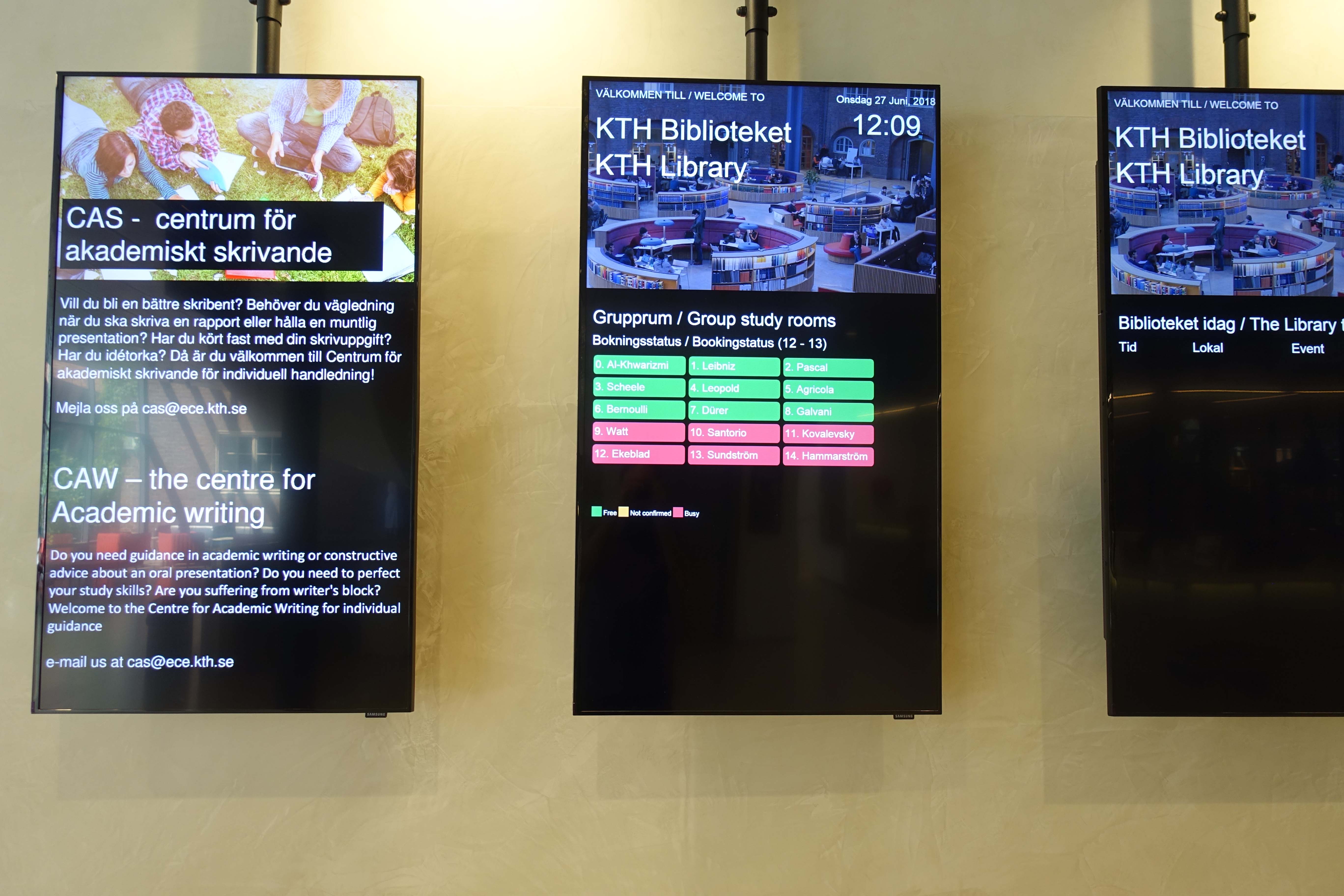
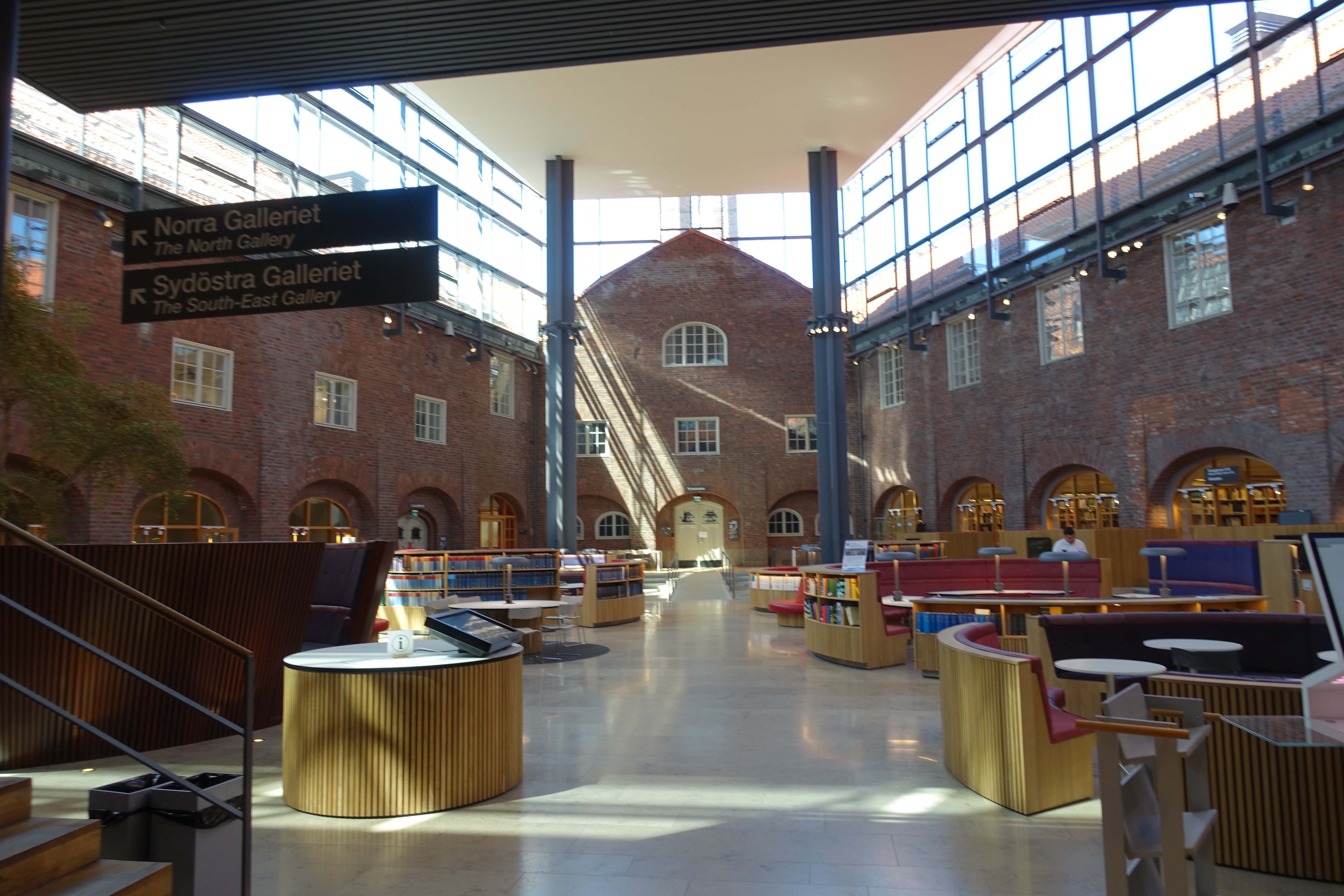
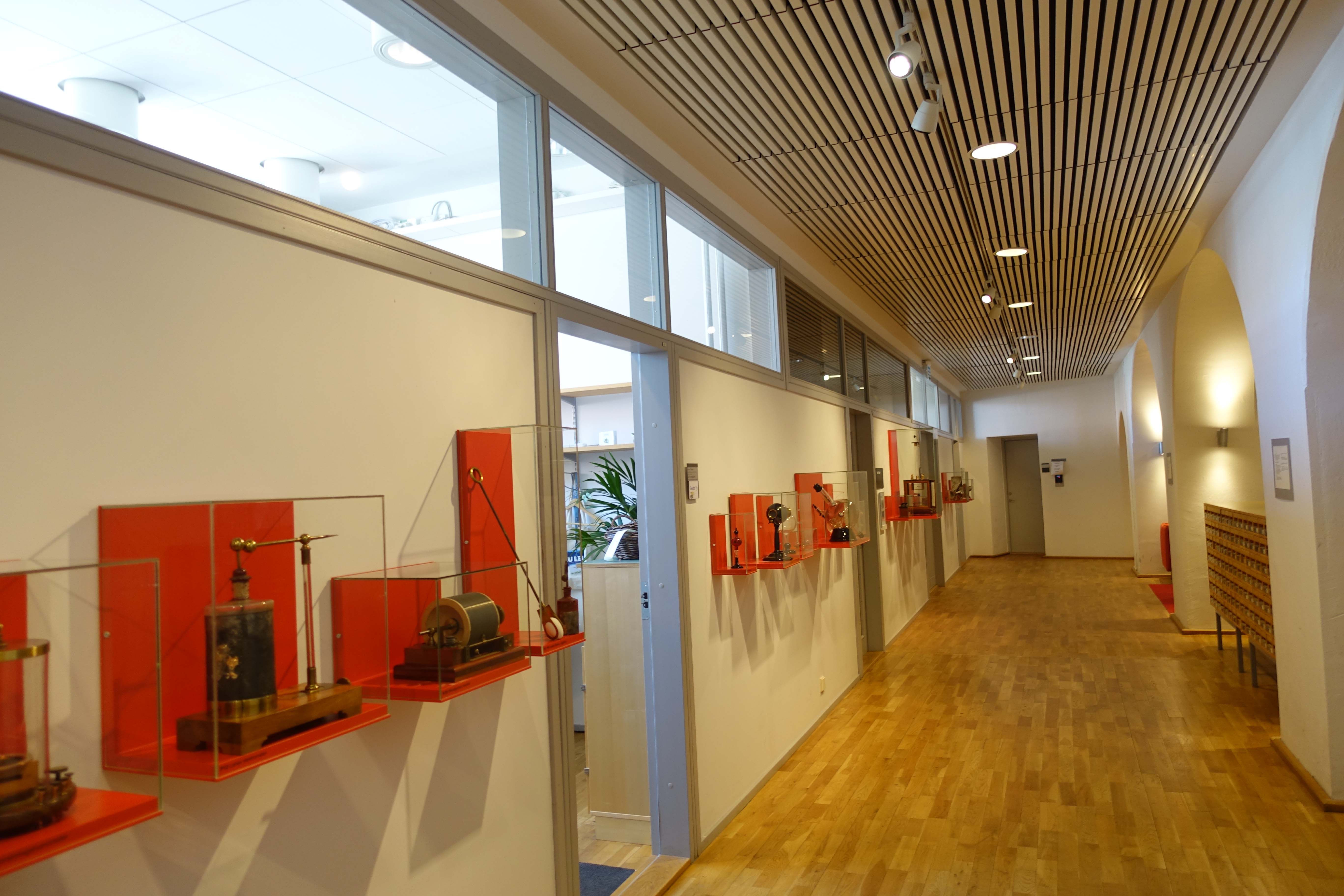
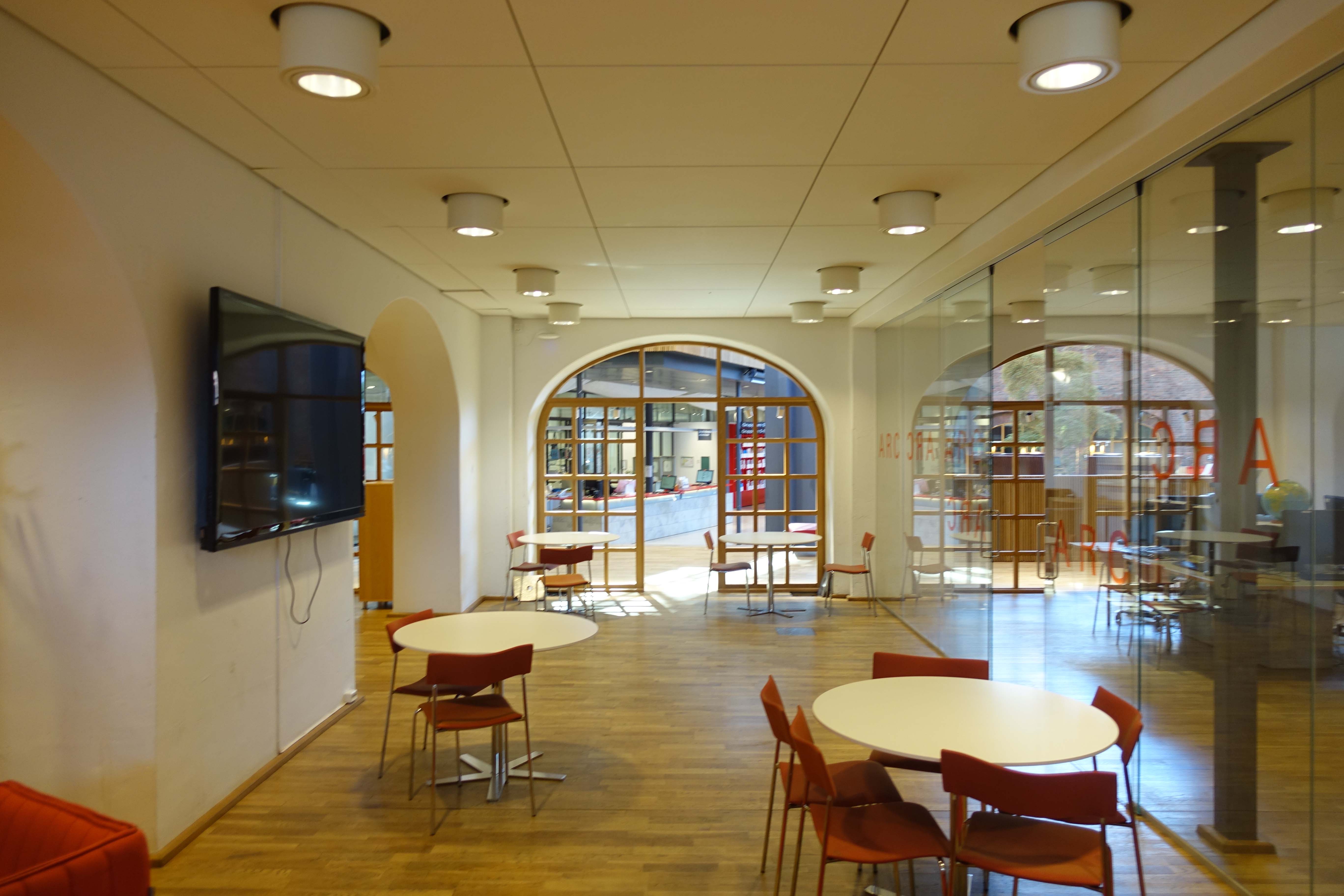
 One really positive outcome of the conversation with Wilhelm was his recommendation to visit the technology school, KTH, one stop away. Apparently, I was told, the library was an incredible design. Sadly, my shoes didn’t like the floor that much and I squeaked with every step I took. Yet there was barely anyone around to distract/annoy. Here are some select photos from that visit to KTH Biblioteket, though I didn’t get a tour or interact with anyone, so I know little to nothing about the history of the building or the types of services it provides.

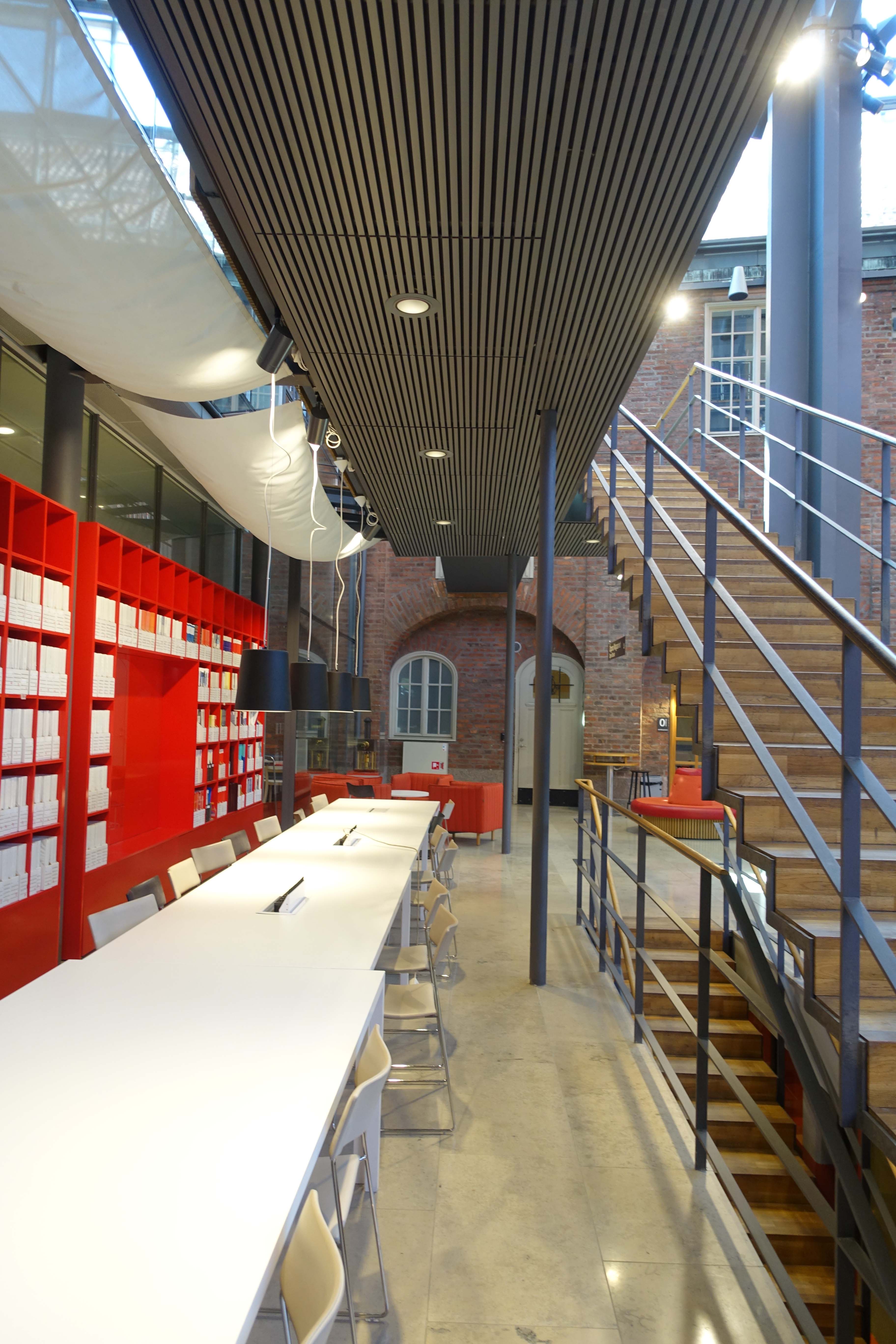

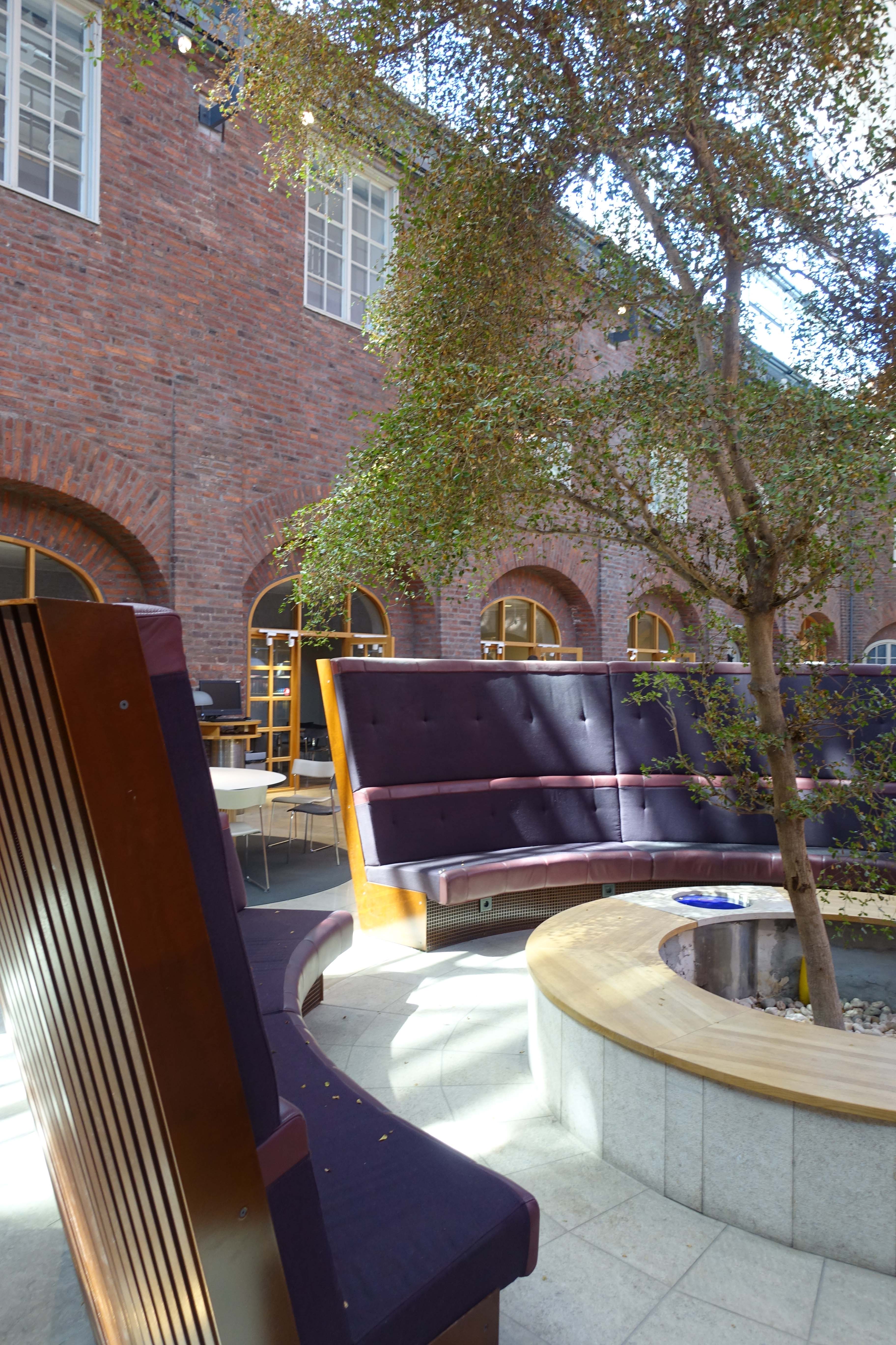
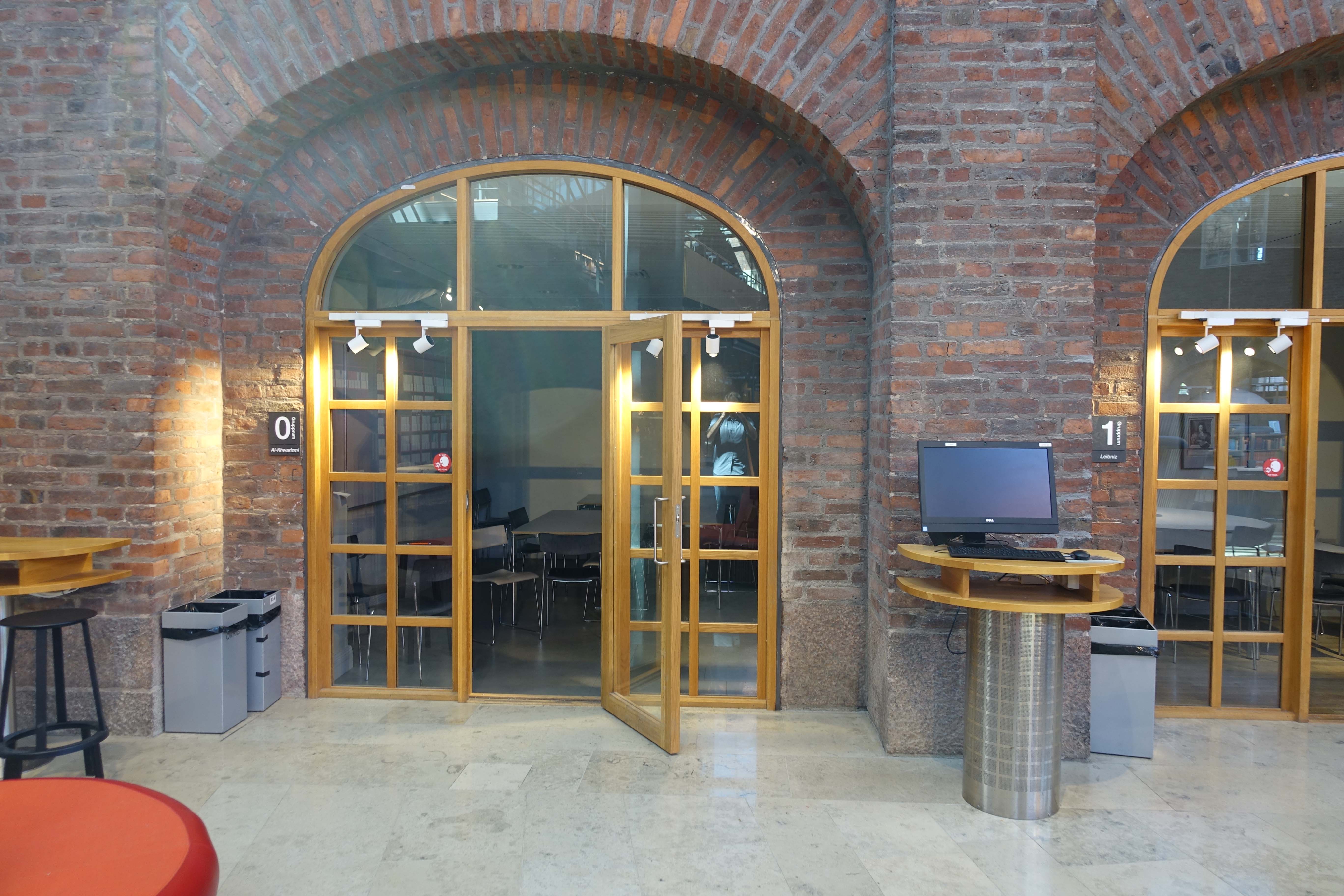

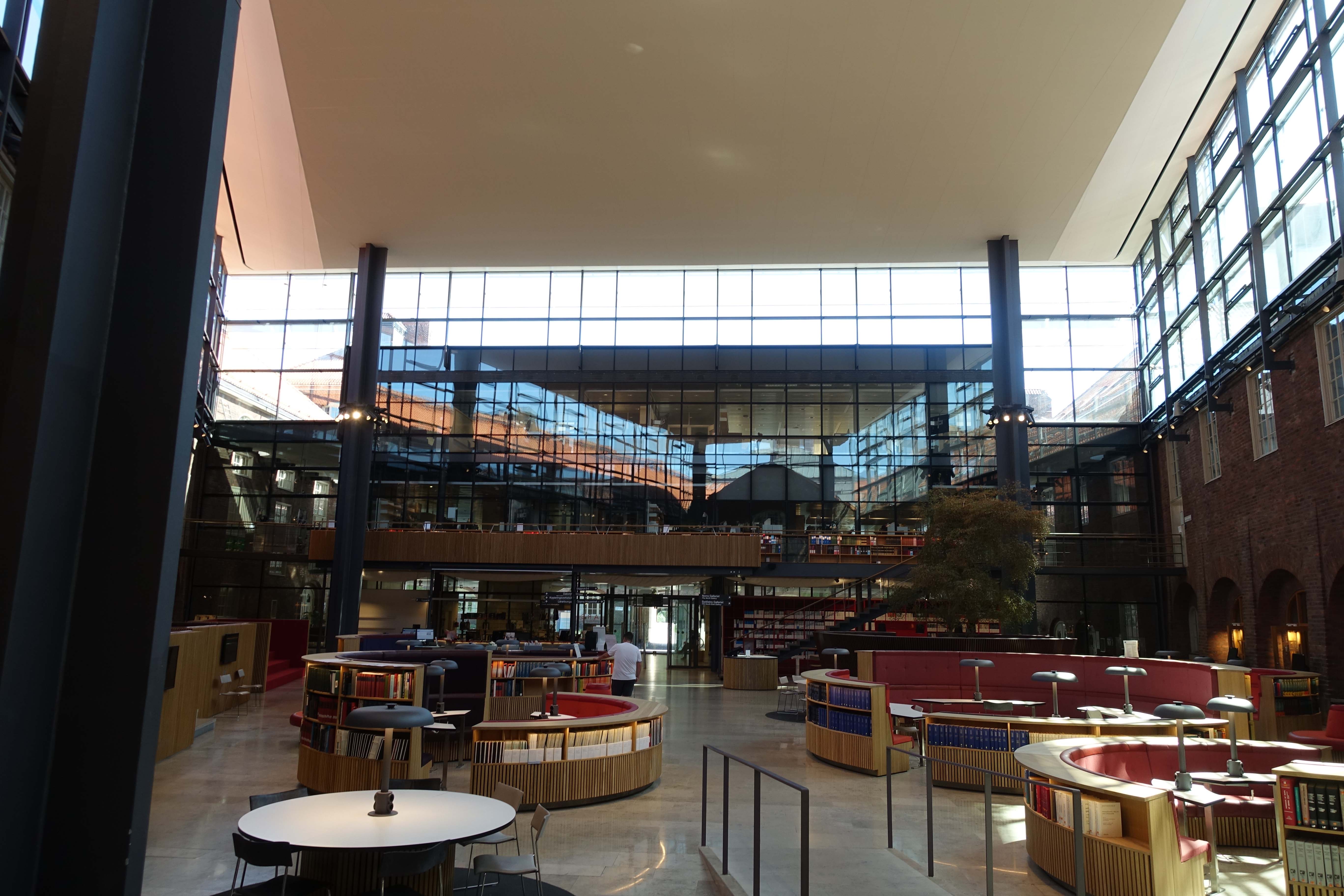

 So, that’s pretty much it. Stockholm contained a lot more than those two library visits, but most of my other travels were not exactly library-related. I did go to a Viking Museum on a whim with my mom, though. And she did happen to force me into a costume, which was as awkward as it sounds and looks. At least the resulting picture is noteworthy:
And that, my friends, is that. A long series of words describing just a handful of things I discovered when traveling. I admit it was a bit messy and lacked some organization on my end, but I definitely had a fun time, and I’m using this sequence as a jumping off point for documenting other libraries (and other spaces) I visit in the near future. All future writings will, of course, be posted on this site. Until next time!
